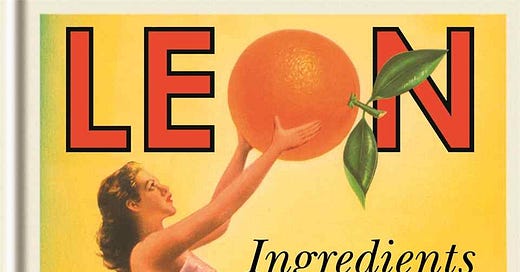
Peek Inside a Restaurant Cookbook Like No Other
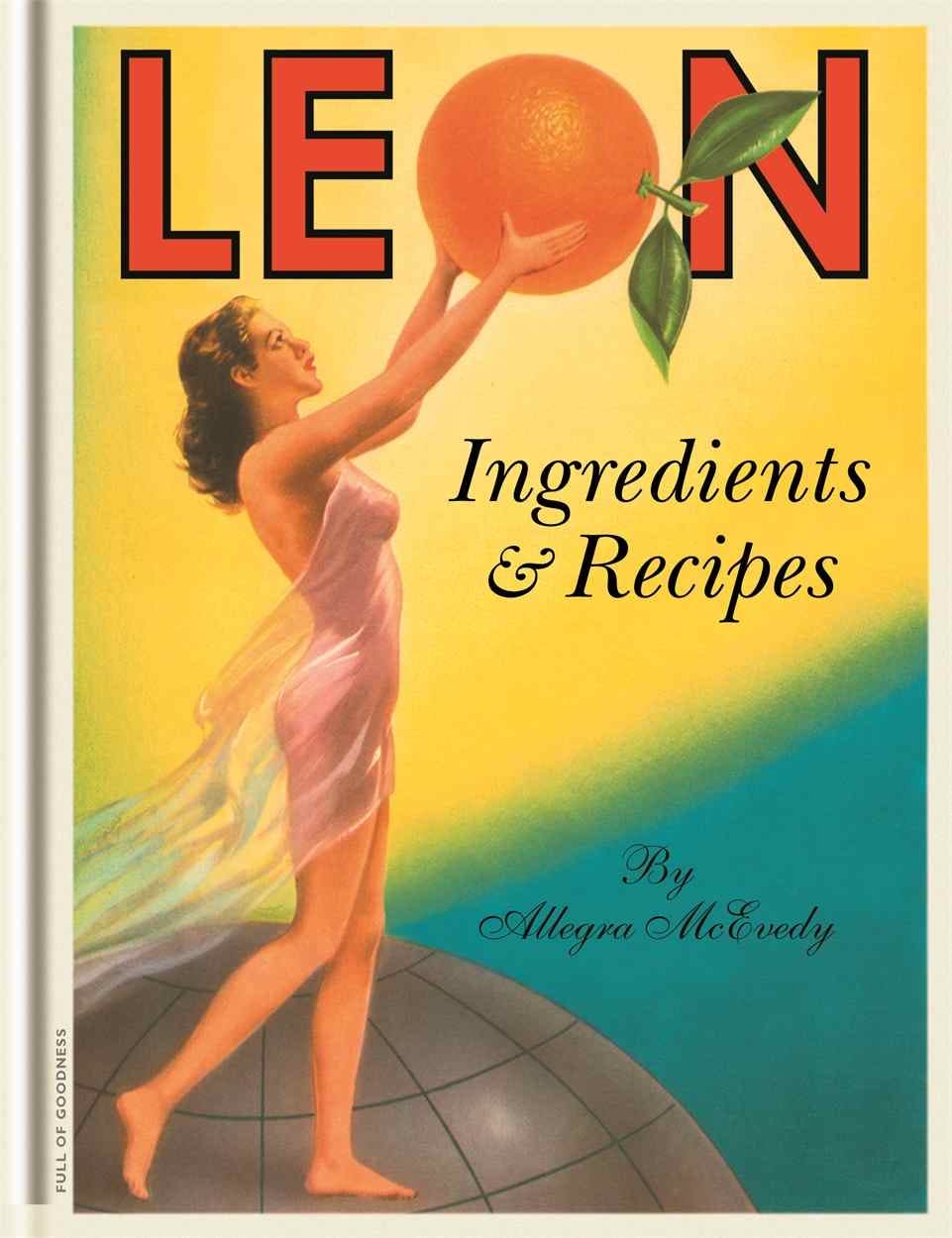
The whimsical, playful, elaborate LEON: Ingredients & Recipes
Howdy cookbook fans!
And welcome to a very special issue of Stained Page News, in which book designer Frances Baca is here to walk us through one of her favorite cookbooks: LEON: Ingredients & Recipes by Allegra McEvedy. Frances has joined us before to go over last fall’s new releases from a design perspective, and I am thrilled to share with you her deep-dive into the design of a single book. Frances, take it away!
Today's issue of Stained Page News is brought to you by Hardie Grant Publishing, and live-fire cooking expert Genevieve Taylor’s Seared. The book is a one-stop shop for recipes and practical advice that will help you get the most from cooking meat on your grill, beginning with the science of why we cook different cuts in different ways and the physics of how fire works. It covers everything you'll ever need to know about buying and cooking all kinds of meat, from steaks and fillets, to large cuts and whole birds, and looks at techniques from brining to marinating, smoking to braising, searing super-hot to low and slow cooking. Full of succulent, colorful recipes, Seared is the most useful, practical and comprehensive guide to grilling meat on the market.
Behind the Design: LEON: Ingredients & Recipes
By Frances Baca
There are several cookbooks that I turn to often when seeking inspiration and nourishment. Of particular interest are the cookbooks that impress me with the thoughtfulness of their design: the way the art is paced, the navigational elements, the typography, the paper and binding, and the many small details that impart information and weave color and emotion into every page. The very best ones have what I call the “head, heart, hands” factor: they command our attention, they resonate with us, and they are accessible enough to ensure good outcomes in the kitchen. LEON: Ingredients & Recipes by Allegra McEvedy is a one-of-a-kind example of this idea.
LEON is a chain of UK-based restaurants serving Mediterranean-influenced “good fast food that does you good,” and the 2008 cookbook features recipes collected from its menu. McEvedy, LEON cofounder and well-known chef and cookbook author in her native England, also asked the larger circle of LEON employees, family, and friends to contribute recipes and share stories of dishes that are particularly meaningful to them. The resulting book is a humorous and endearing reflection on memory, family, and food that is coupled with practical information on sourcing, ingredients, and seasonality. Though LEON has been sitting in my bookcase for many years, I still find myself pulling it out over and over not just to cook from it (the superfood salad is my go-to, page 198) but to marvel at the complexity of its design.
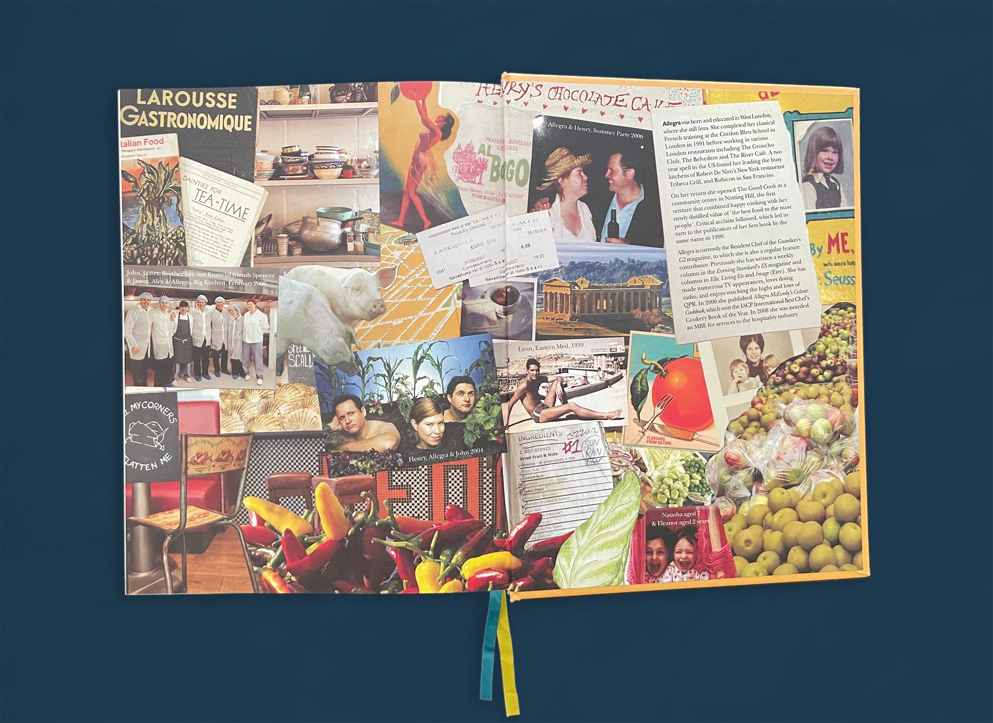
I first encountered LEON at a local bookstore, where its cheerful cover called out to me from the shelf. I was not familiar with the restaurant, so I had no context for the visual exuberance of its brand and was taken aback by the book. Though conventional in its structure—introduction, table of contents, parts, chapters, appendix—its design is boldly unconventional. McEvedy, reached via Zoom at her home in London, explained to me that she had in mind her late mother’s treasured handmade recipe book when she conceptualized LEON. Indeed, its pages feel more like a scrapbook than a cookbook: chock-full of souvenirs, collages, photos, personal stories, and quirky drawings, not to mention technical elements such as gatefolds, die cuts, and perforated inserts (more on those later). This book was nothing like any published cookbook I’d seen before, nor since.
The sheer breadth of visual material in LEON could easily, in the hands of less skilled designers, be a jumbled mess—succeeding in catching readers’ eyes but failing to engage them any further. LEON’s creative team transcends this pitfall in that, page after page, it effectively immerses us in the story of the LEON family and its food. Though the designers push the fundamental book design concept of “constant and variable” to its limits (more on this later as well), they never quite upset its balance. So while LEON’s overall structure is simple, and all of the things that we would expect to find in a cookbook are there—art, titles, headnotes, ingredients, yields, method, etc.—it’s the fantastic variability of their treatment that makes this book so special.
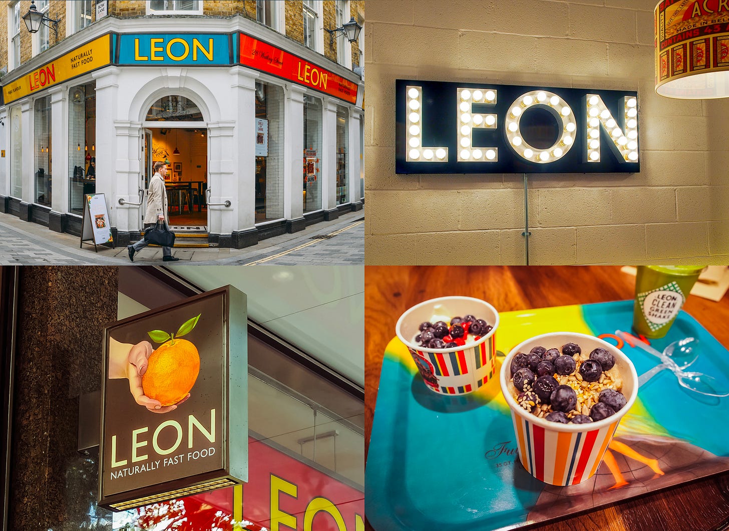
Alex Dearden, LEON’s former brand manager, worked alongside McEvedy from the book’s inception. Armed with a deep understanding of the LEON brand and McEvedy’s unwavering trust, Dearden dove into what became a fantastically all-consuming journey into designing a cookbook—which she had never done before. “We had lots of fun creating what I think Allegra would probably call quite a ‘bonkers’ book proposal, complete with beetroot stamps, beetroot seeds, and old family photos stuck in with sticky corners,” describes Dearden. “We wanted the book to feel handmade, very LEON, so that it resonated with people.” The book proposal was enthusiastically received by several publishers and eventually published by Conran Octopus Limited in London.
Jonathan Christie, then art director at Conran Octopus (currently Creative Director of Octopus Publishing Group), partnered with Dearden to help build the book. His technical design skills complemented Dearden’s deep knowledge of the LEON brand. Christie explains that “she described and scribbled ideas, and I tried to translate her thoughts on the screen.” As Christie coordinated the design, Dearden brainstormed visual concepts with McEvedy and “co-cooker” Fred Dickieson. Many of the layouts were created by hand and then photographed, with unique design treatments for almost every section in the book. Among these are photo collages of LEON family and friends (many created on Dearden’s bedroom floor), adaptations of vintage fruit packaging, a mosaic made of colorful dried beans, jewelry crafted from peas, a pull-out cheese map of Europe, stickers, and many other visual treats. McEvedy recalls that “The whole thing was driven by the belief that we could do anything!” The more technical production elements are particularly remarkable for a cookbook. Christie describes their effect as “more like a children’s book than a cookery book.” Not all ideas, however, made the cut. A scratch-and-sniff section was rejected, as was a suggestion to glue in packets of seeds. The book does not suffer their absence, as there is still a wealth of material embedded with humorous details to enjoy.
LEON restaurants went on to publish several more cookbooks, although these books lack the quirky scrapbook feel and technical features of the original. The manufacturing expense of die cuts, inserts, stickers, and so forth was certainly a major factor in this decision, but the LEON team also felt that this approach would become too predictable over time.
LEON’s unique design—completed, impressively, in six months—was clearly a labor of love. When I spoke to the designers, author, and illustrator, it was apparent that they had a very clear vision for the book and understood how to build upon each other’s strengths in order to realize it. The great fun that they had in designing LEON is obvious, as are the genuine respect and affection that they had for each other. Their playful and harmonious collaboration was the true superpower that breathed life into its pages.
Fourteen years after LEON’s publication, I still come across copies of it in well-stocked bookshops, and I always feel compelled to pick it up. My fondness for its wacky and decidedly unpolished design has not faded over time. Dearden reflects with great pride upon the book, remarking “I still walk into houses and feel so happy to see it on people’s shelves.” Though LEON had no ambition to reach beyond the UK market when it was released, it found an audience worldwide with more than one hundred thousand copies in print in English, German, and Dutch. “I think it surprised people—it was a very fresh way of making a cookbook,” explains Christie. “I still get comments about it now, so it clearly is viewed with affection.”
Flipping Through the Book
LEON: Ingredients & Recipes plays with the book design convention of “constant and variable,” where there is a careful balance between creative expression and systems thinking. Within this idea, designers compose pages that have visual cohesion and easy flow in order to invite readers into the story and help them navigate through it. Consistent typefaces, sizes, colors, margins, and positioning of elements are the constants that ground the reader’s experience. Within this stable framework, designers will insert something new or will treat something in a way that departs from the reader’s expectations. These are the variables that catch readers off guard, pique their interest, and draw them in. The following photographs illustrate the wild inventiveness of LEON’s creative team, whose skillful management of constant and variable keeps readers focused, engaged, and entertained. Click on any image to zoom into the details.
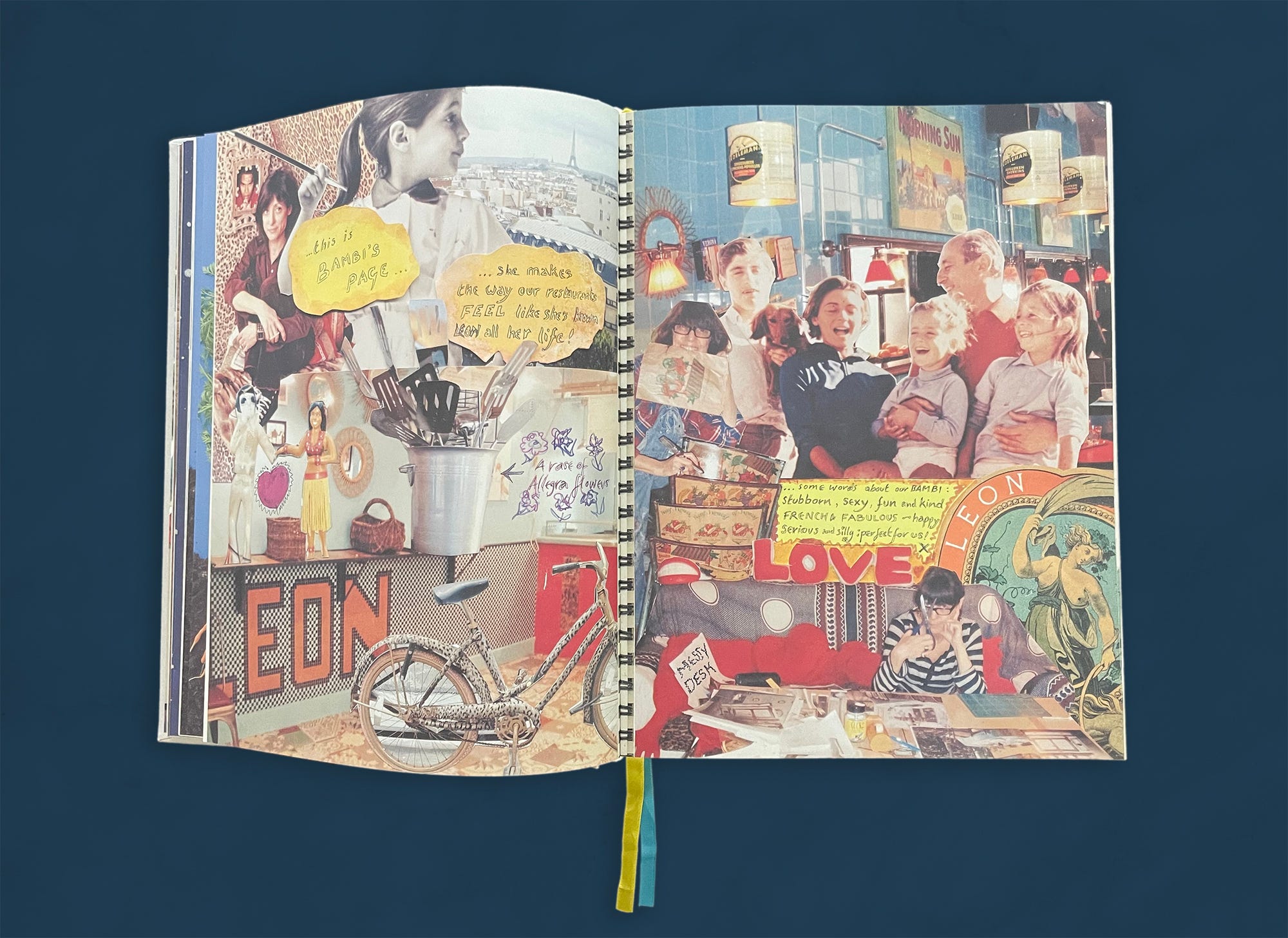
Several pages in the book are animated with colorful collages by designer Alex Dearden. The endpapers provide a frame into which the book expands, and they signal to us the very personal and playful stories within. LEON’s original interior decorator, Bambi Sloan, is recognized with her own collage for the important contributions she made to the look of the restaurants.
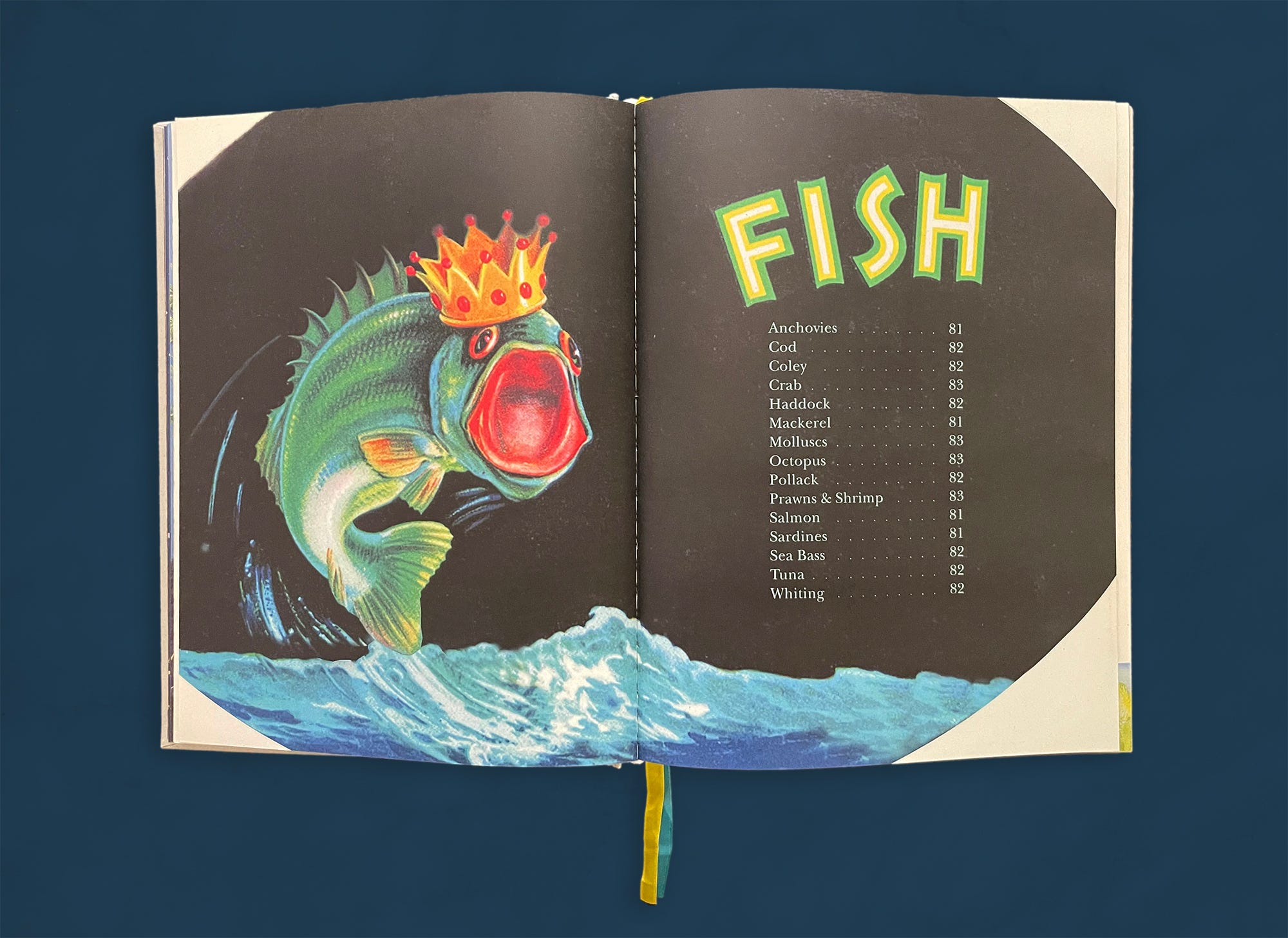
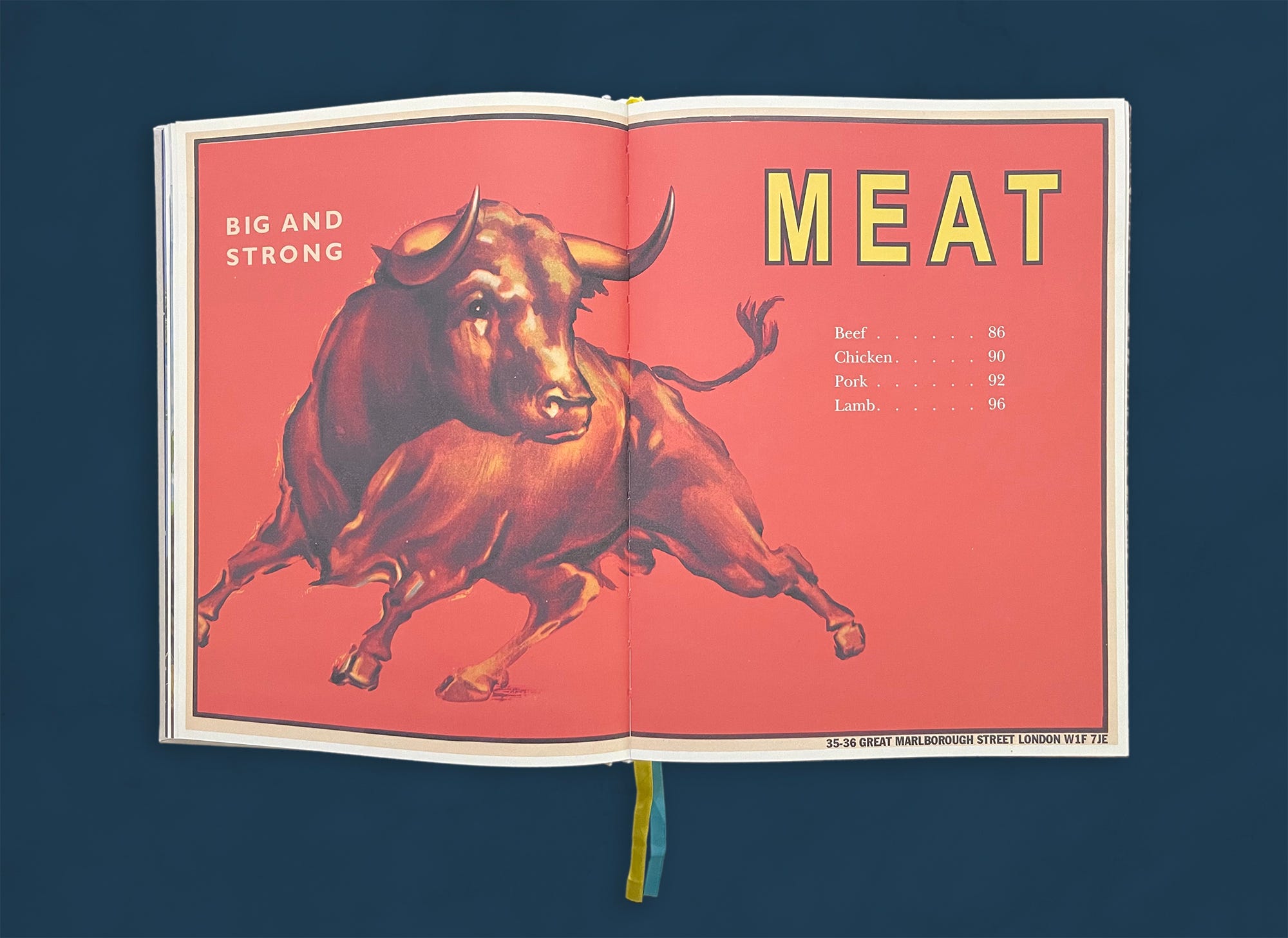
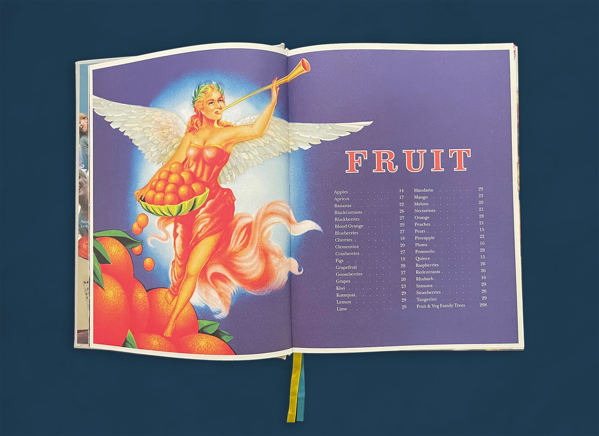
Vintage packaging art figured prominently in the early LEON restaurants and was adapted to the chapter openers in the first part of the book, titled “The Ingredients Book.” The figures are always positioned to look to the right to help direct our eye toward the text and into the chapter. The “Fruit” chapter is the first in the book, and the opening page reads more like an index than a table of contents—a subtle indication that what we are about to experience as readers is not quite what we might expect in a traditional cookbook.
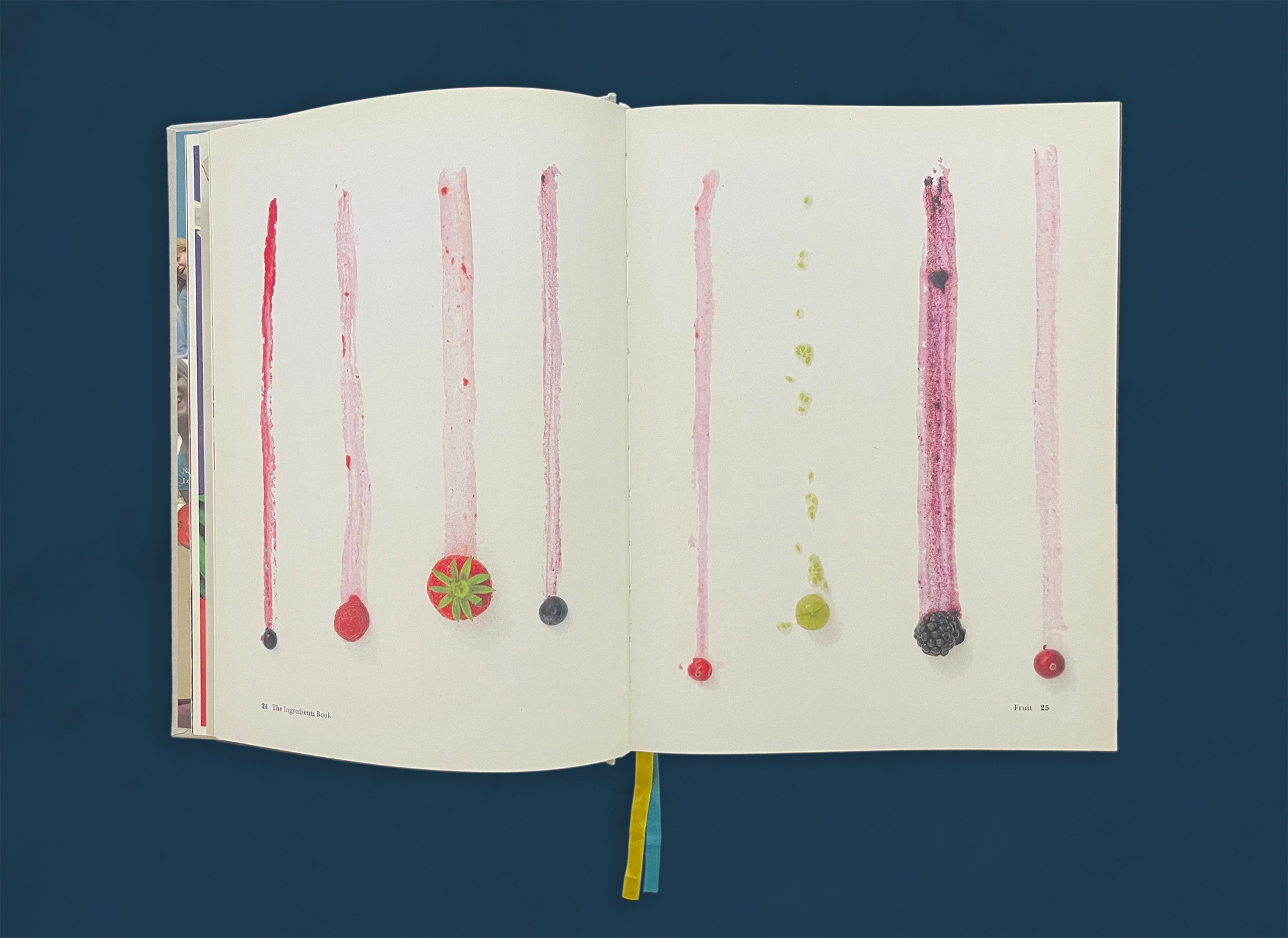
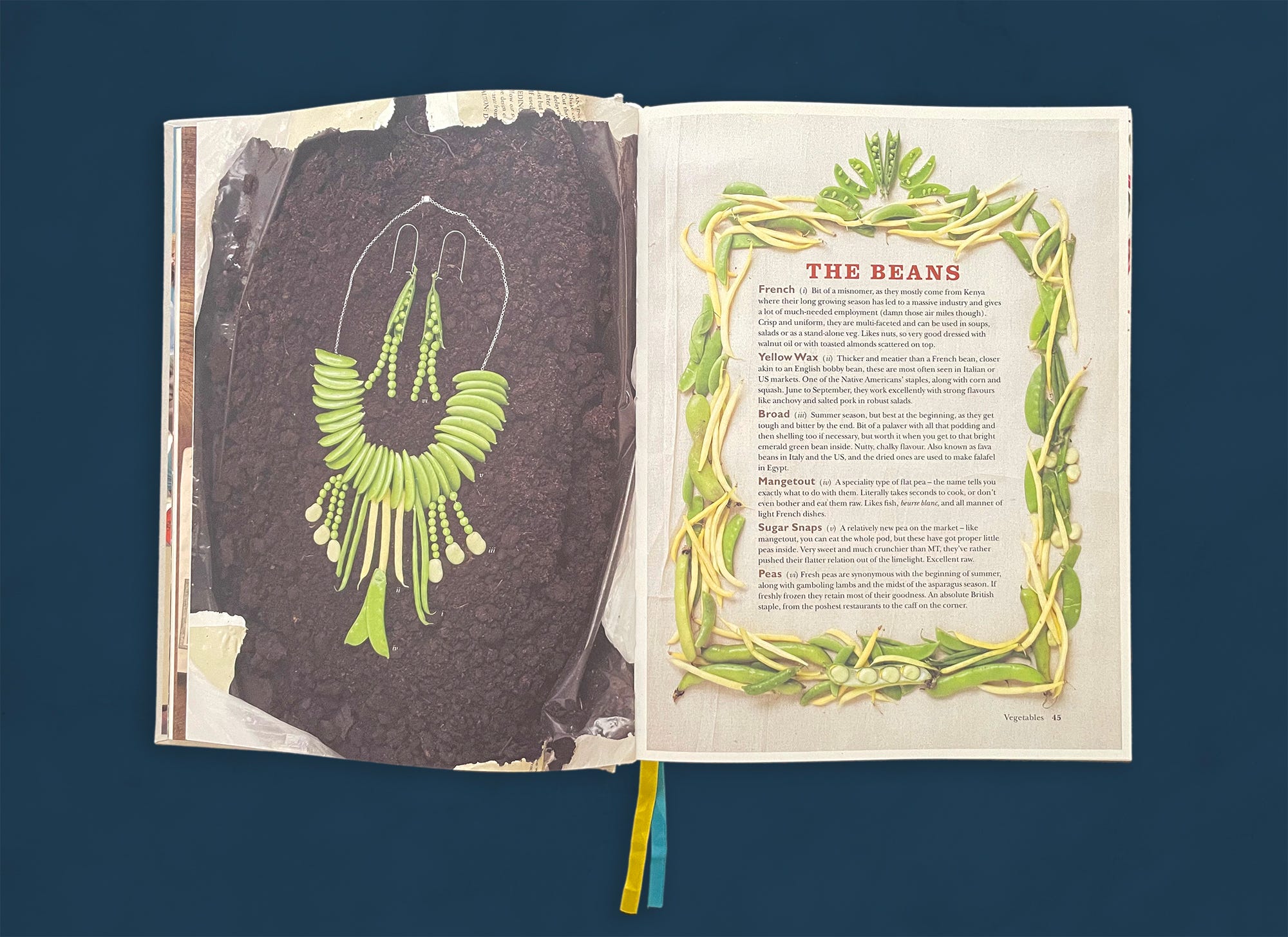
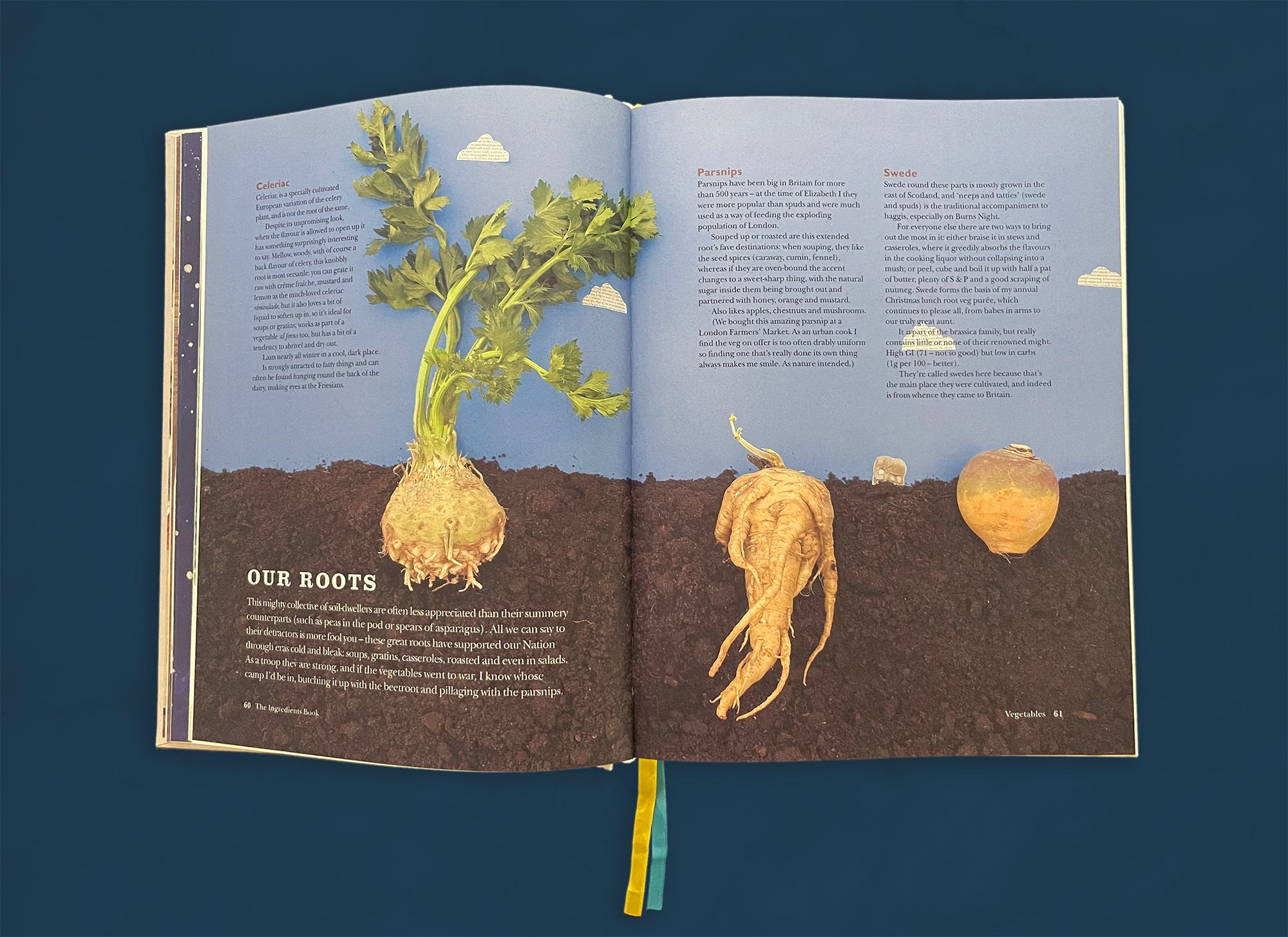
The photographs were conceptualized collaboratively between photographer Georgia Glynn Smith and the creative team, often incorporating new ideas spontaneously. “I’d bought a vintage map of Italy and Smith poured flour in the middle and cracked eggs on top during the shoot,” explains Dearden. “It was all quite organic.” The berry profile illustrates berries and currants racing down the page, leaving behind juicy and colorful trails. Jewelry made from peas and beans was carefully positioned and shot on a pile of compost. The compost appears again in the “Our Roots” section—complemented with clouds and an elephant cut out of paper and a plastic centipede.
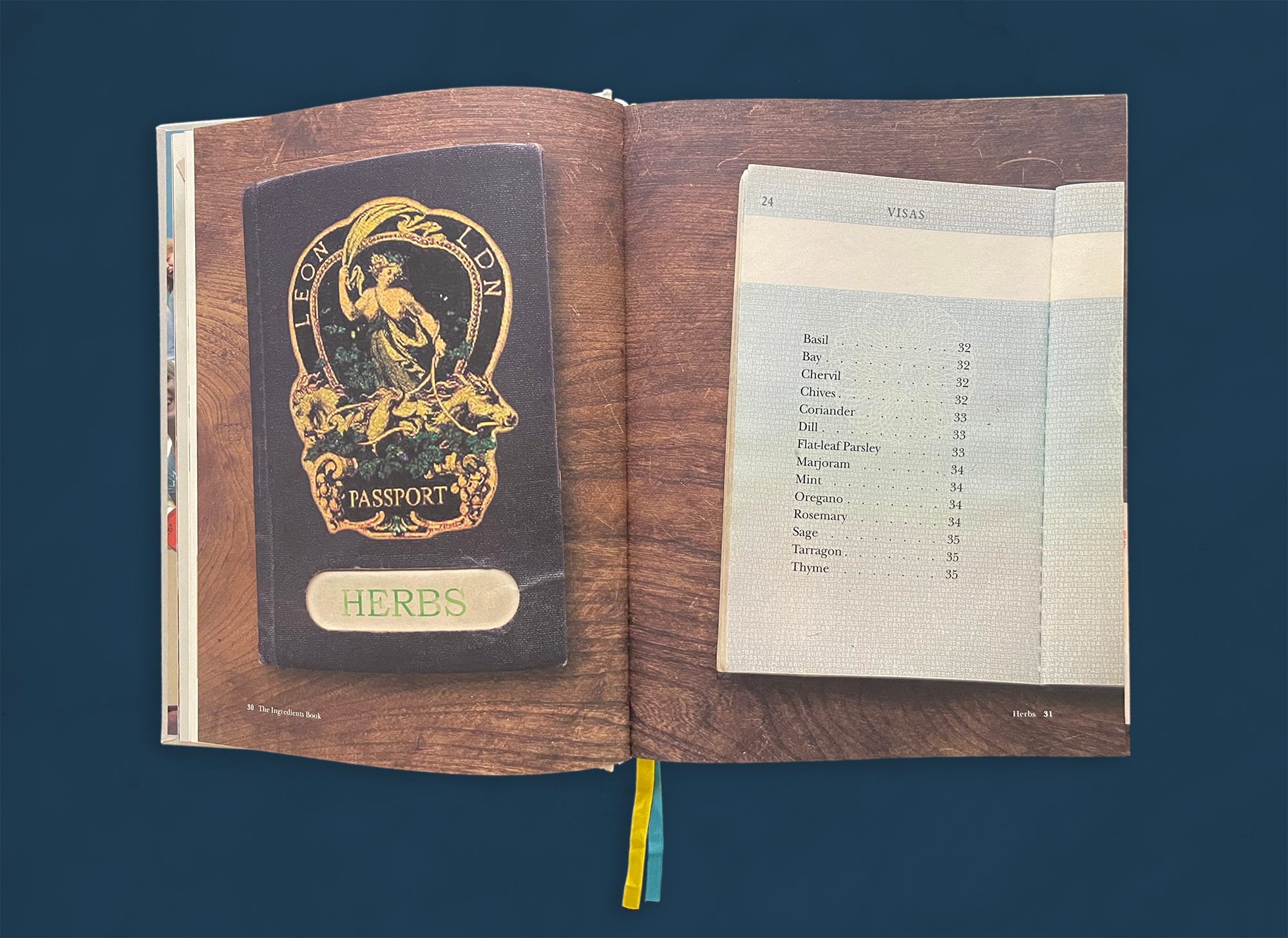
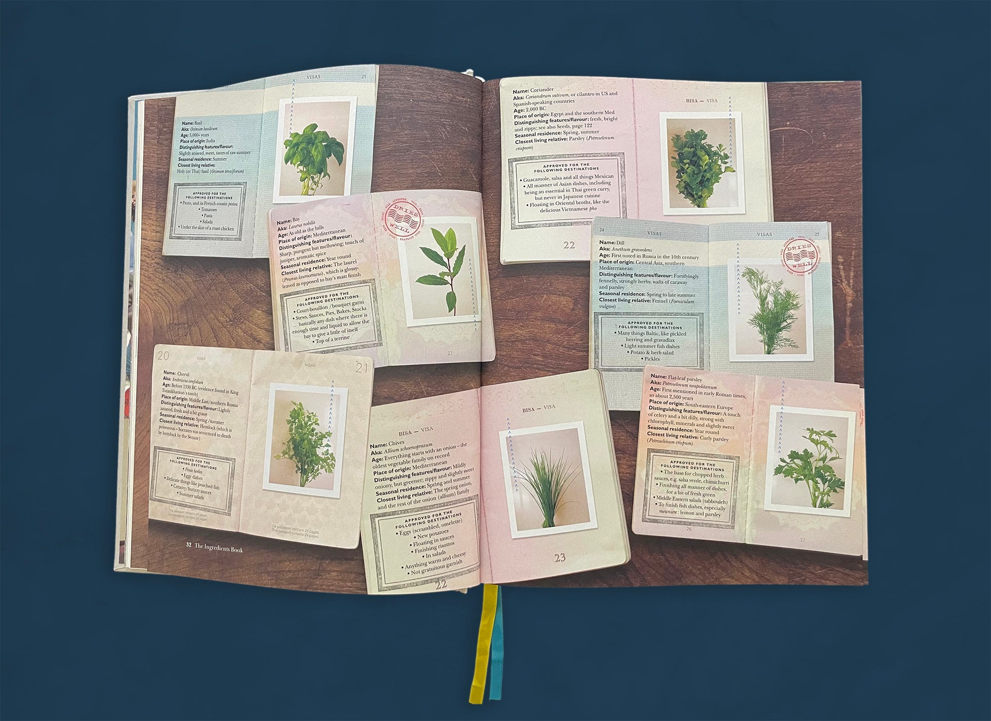
A passport photo booth in a local supermarket inspired Dearden, McEvedy, and chef Fred Dickieson to create the memorable “Herbs” section. Each profile consists of a list of handy facts and an unstyled photo, along with “stamps” detailing further practical information on best preparations.
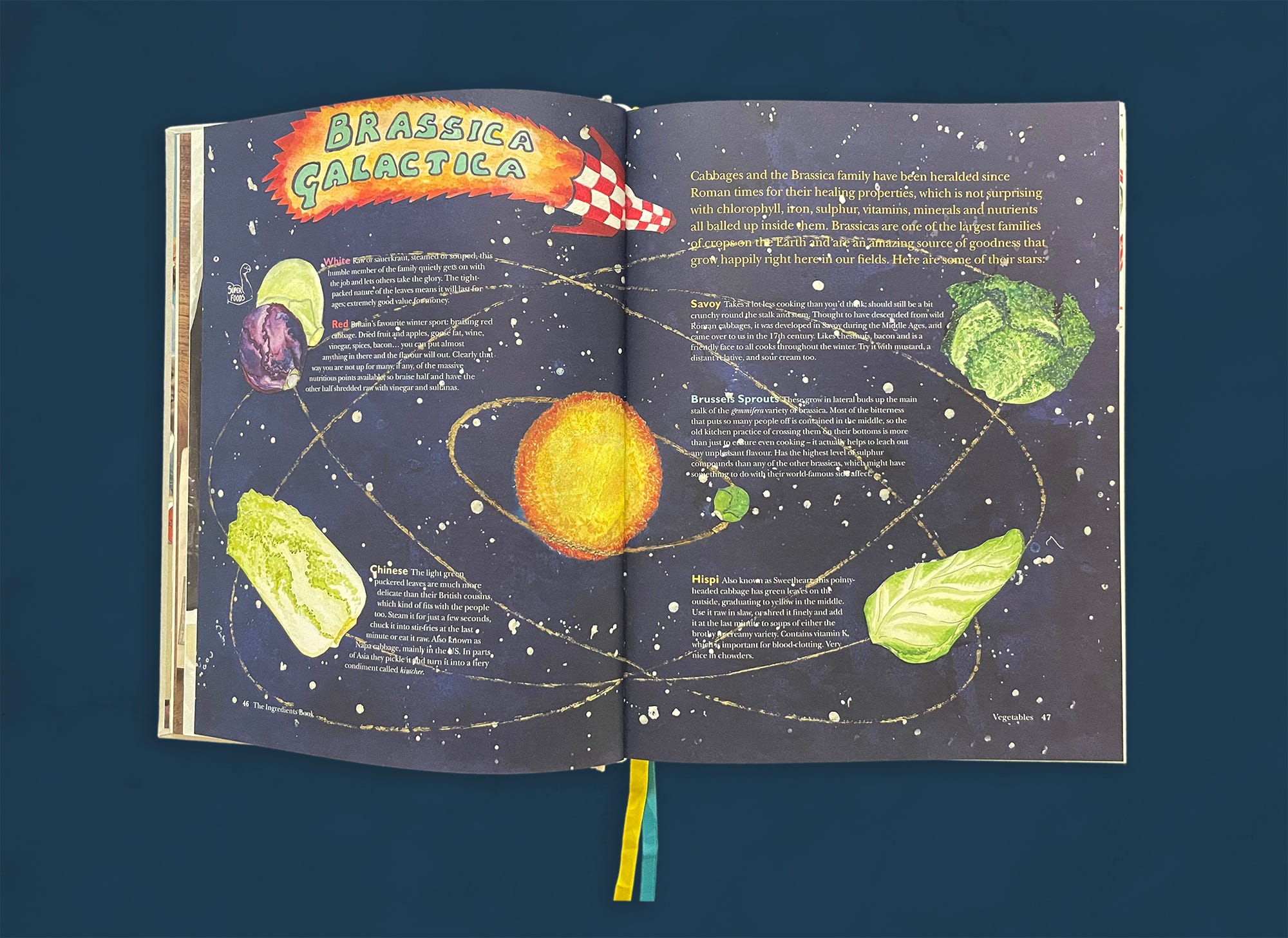
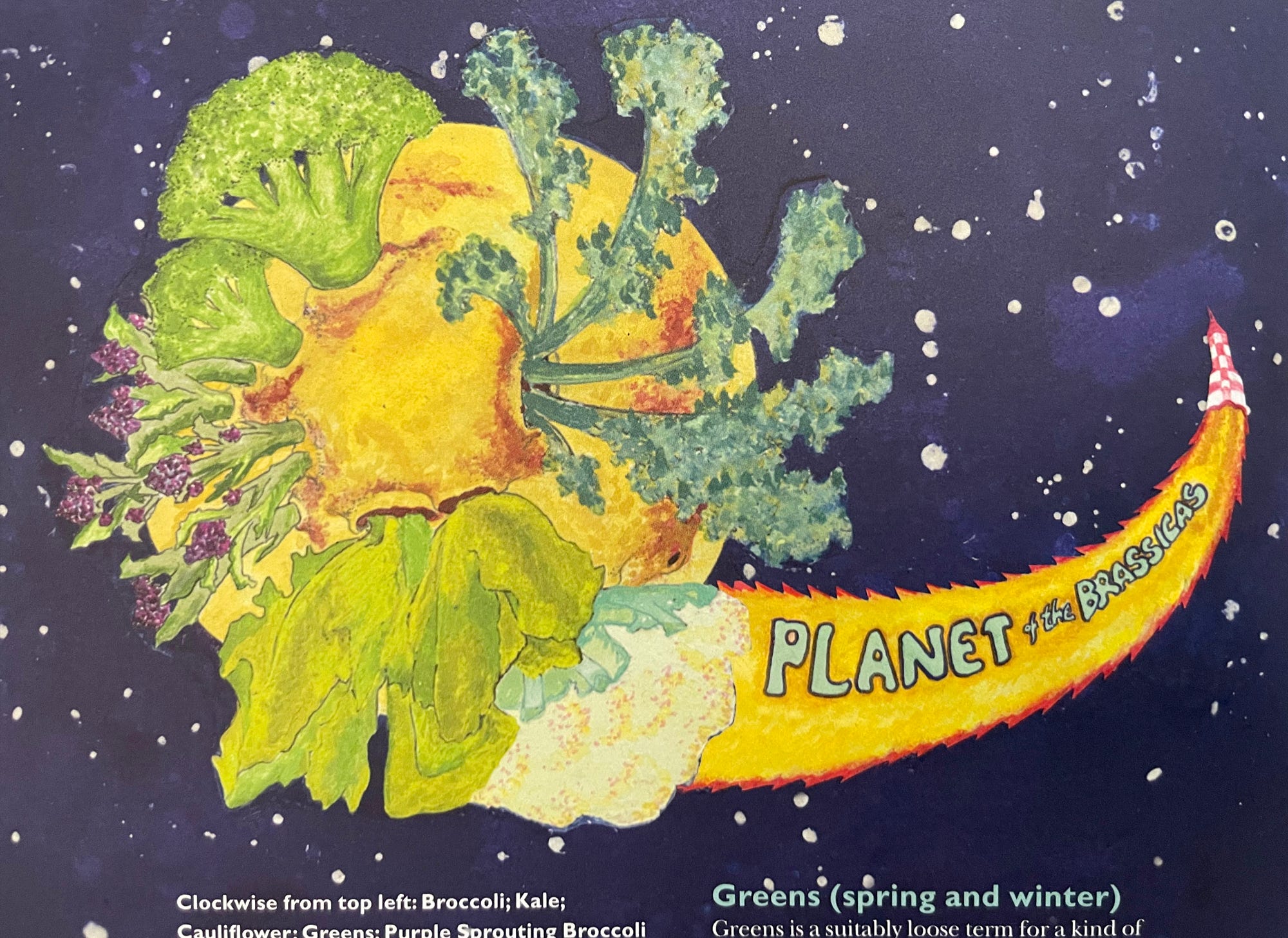
Flora McEvedy, Allegra’s sister and a creative talent in her own right, painted the “Brassica Galactica” section. These pages add a little sci-fi drama (and humor) to the sometimes underappreciated brassicas, highlighting its star varieties.
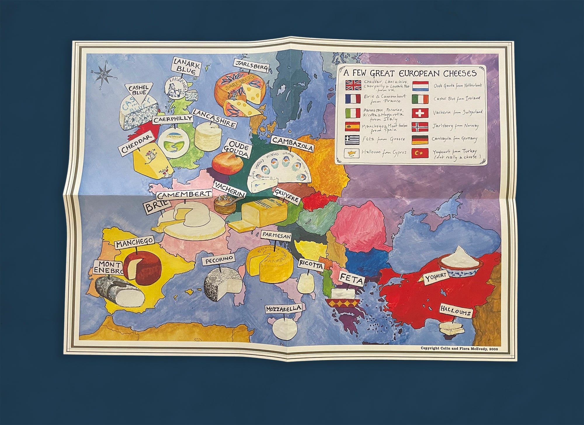
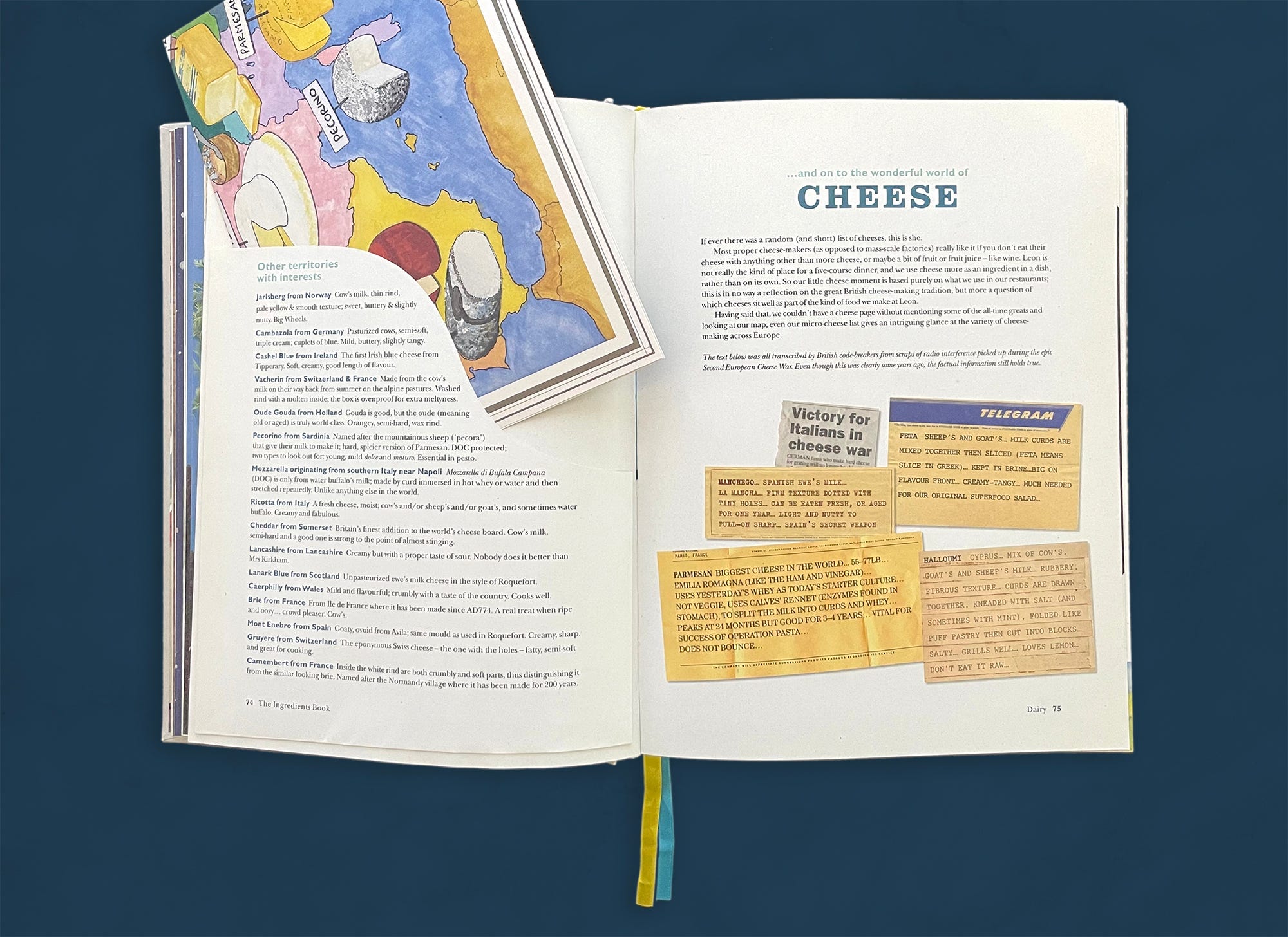
The cheese map painted by Flora McEvedy is perhaps the most complex element in the book. The map measures 16.5 × 11.5 inches, is folded into quarters, and is tucked into a specially designed envelope. Its production requires special trimming and folding, glue to adhere the envelope, hand applying envelopes to each page, and hand inserting maps into each book. Costly production elements such as this in trade market cookbooks are very rare. Facing the map, the opening text of the “Cheese” section features a set of notes purported to have been intercepted by British code breakers during World War II, and they are an example of the humor that resonates throughout the book. Allegra McEvedy recalls these notes with a laugh, saying, “Why would you do that—it’s so bonkers!”
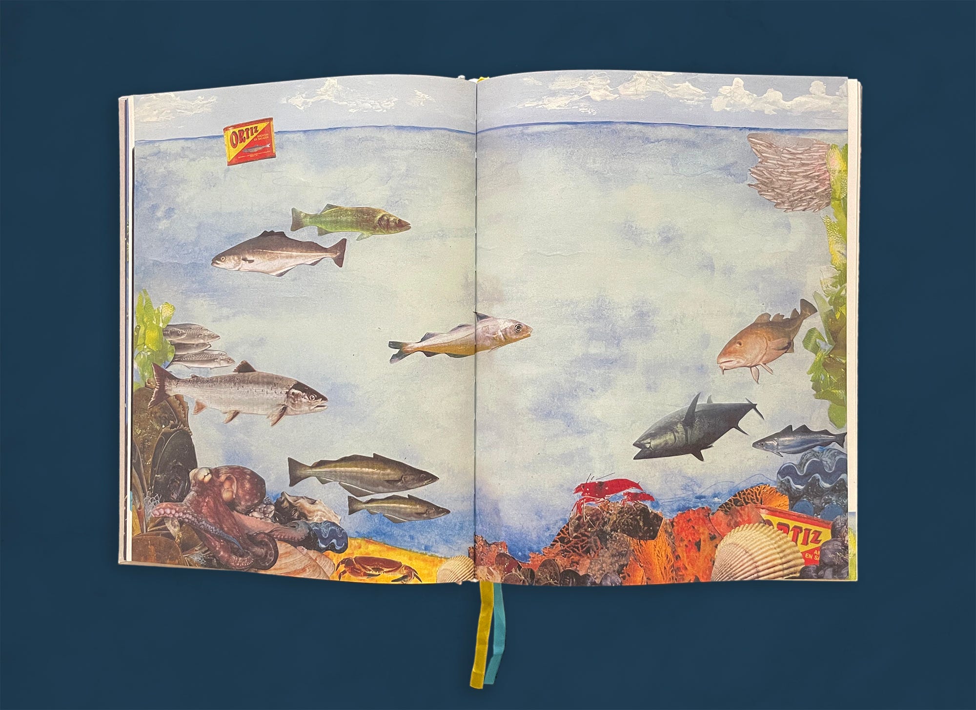
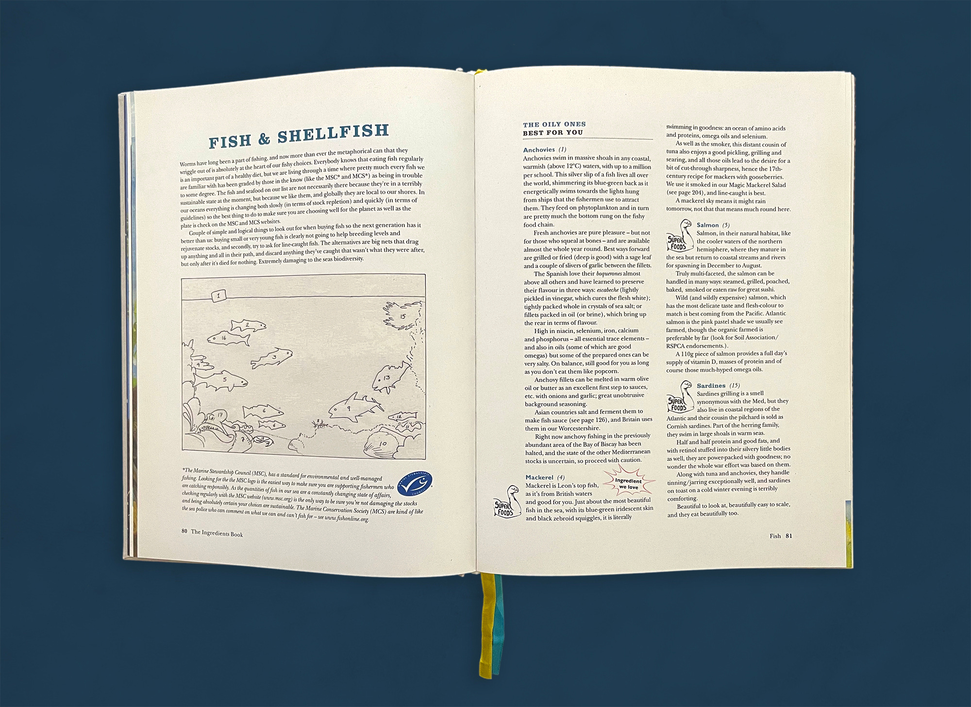
“Fish & Shellfish” opens with an underwater collage by Flora McEvedy, with a key on the following spread. The icons shown here (“Super Foods” and “Ingredients We Love”) appear on many other pages throughout the book and help us identify and cross-reference specific qualities of the ingredients.
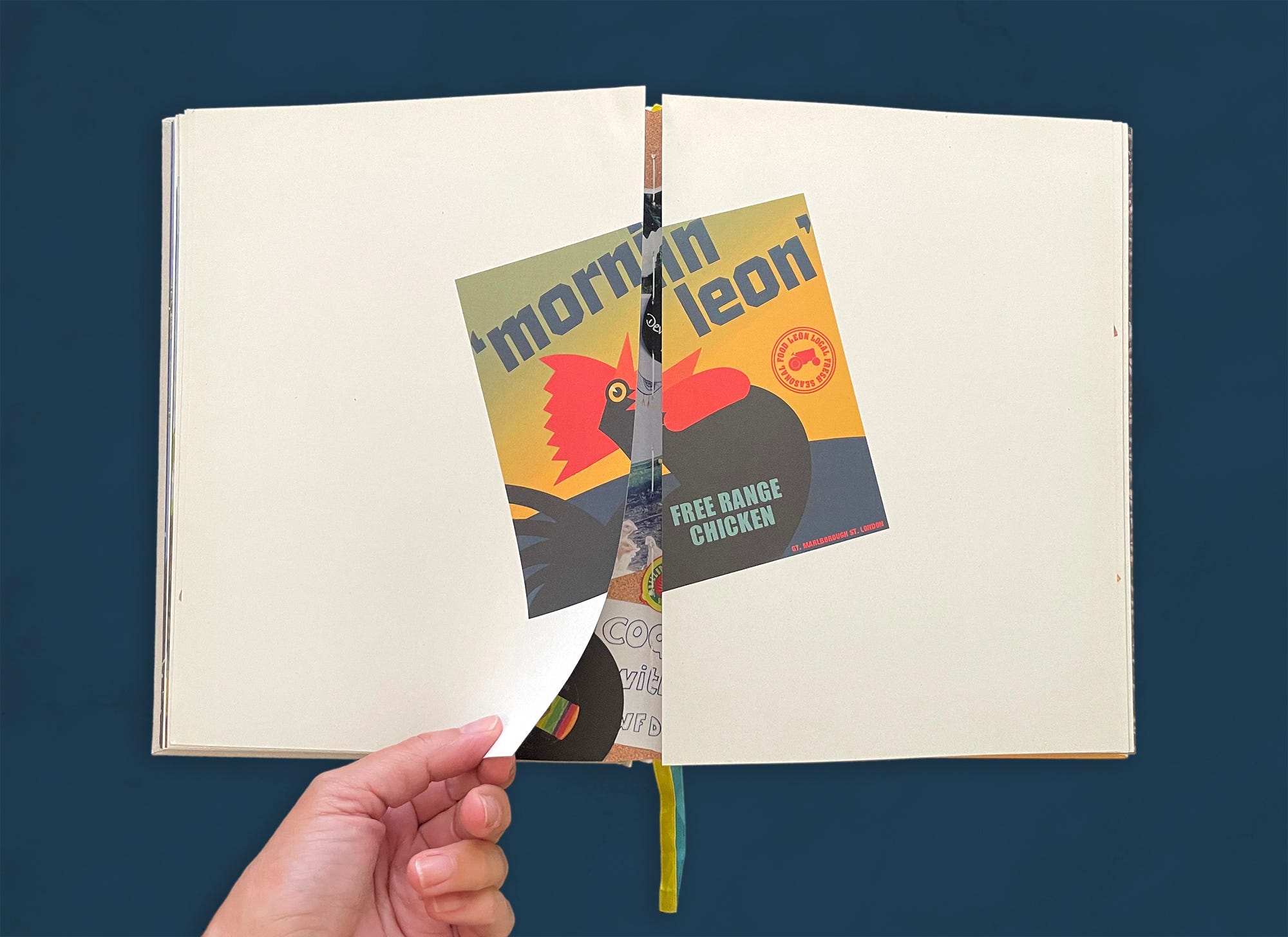
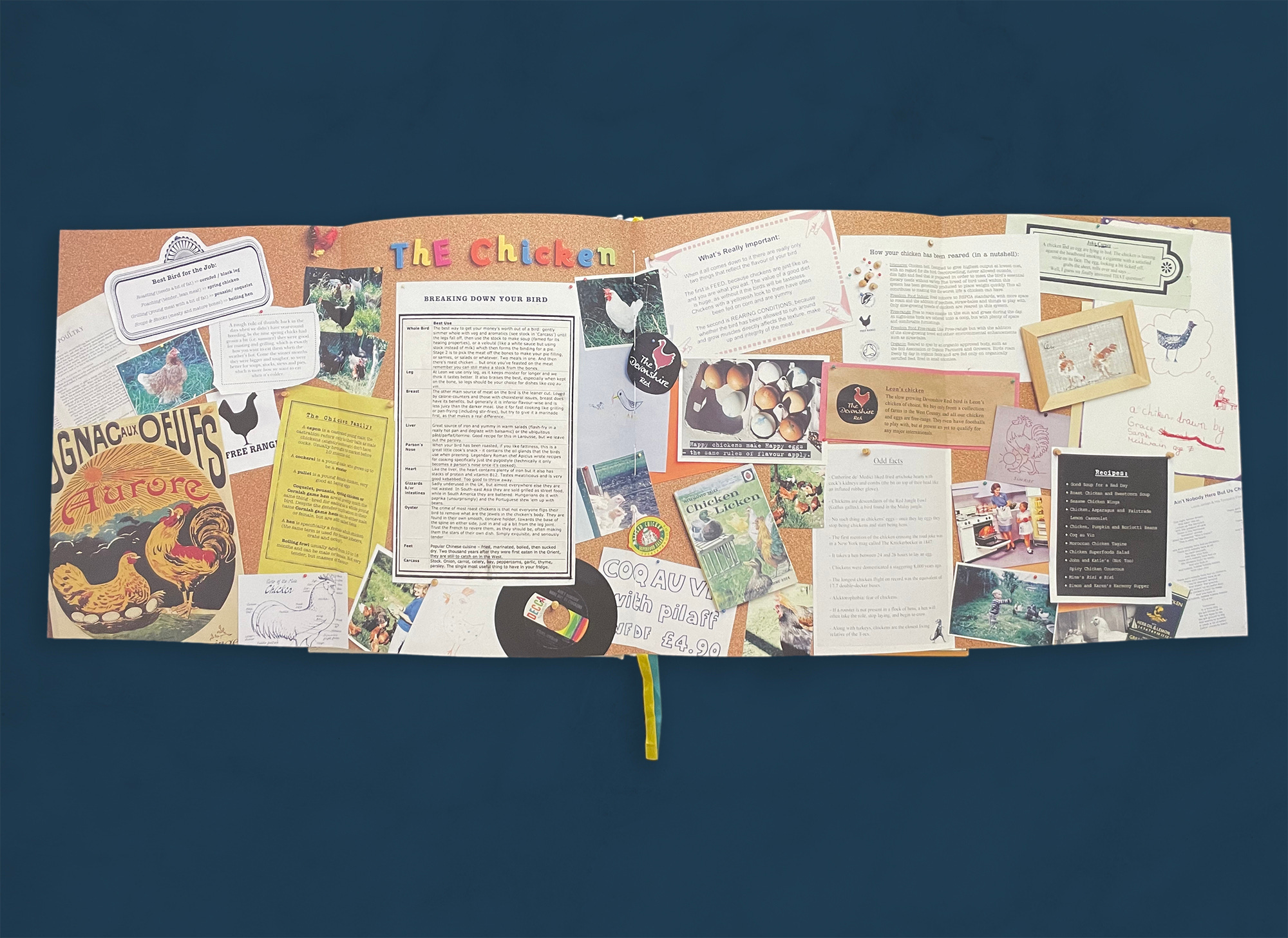
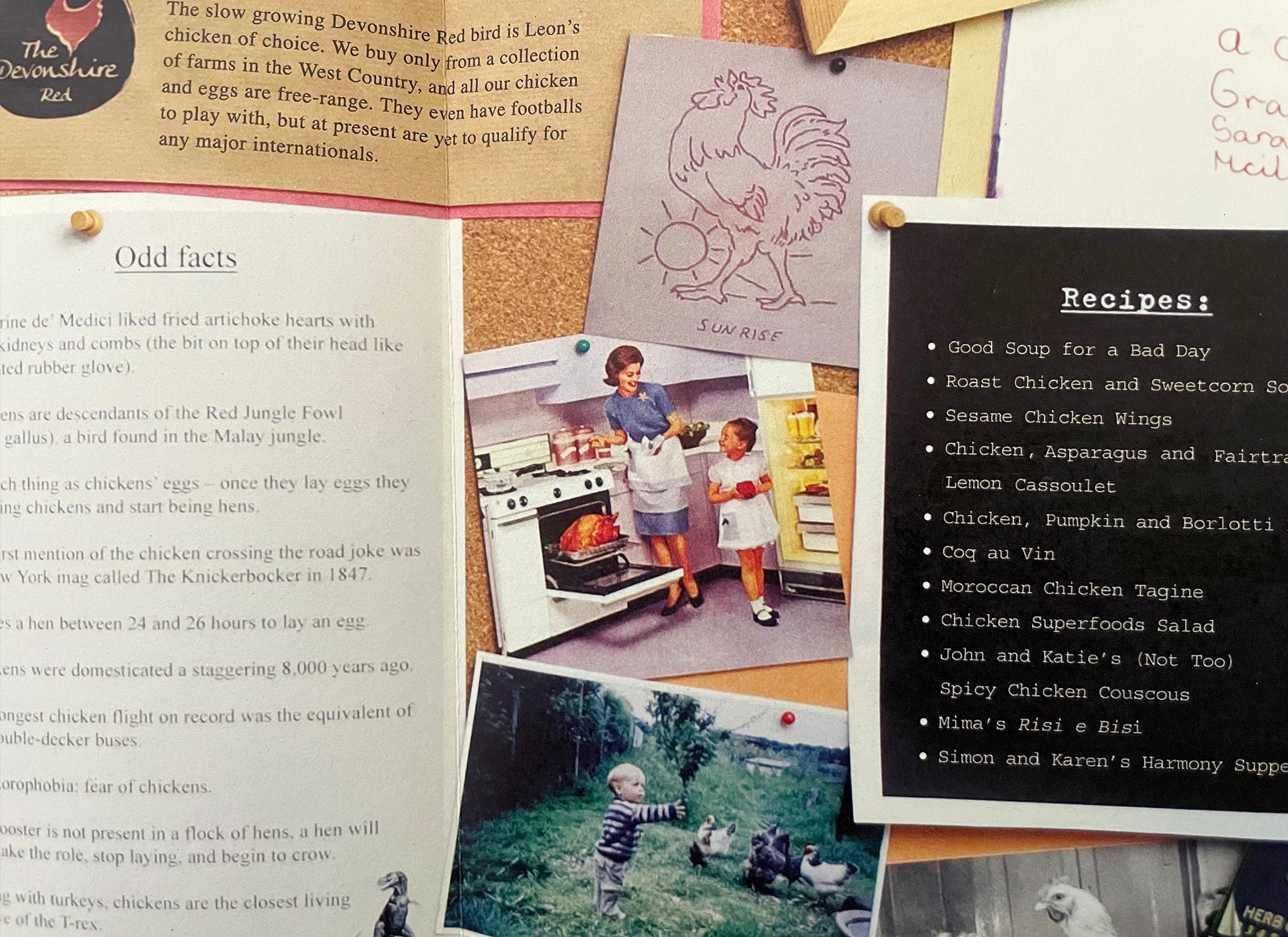
LEON includes two gatefolds (foldouts that open to double the size of the page—a treatment usually reserved for art books). The first one appears in the “Chicken” section. Here, a small vintage chicken illustration opens onto a busy and vibrant corkboard spread. Dearden explains that “I got the most enormous roll of cork to make a giant corkboard with all things free-range chicken . . . I gathered things from vintage record stores and bookshops, borrowed family pictures, and then I typed out many of the written elements on different papers before we photographed the whole board.” The element of surprise at play here is key to the lively spirit of the book and keeps us turning the pages to see what else might be in store.
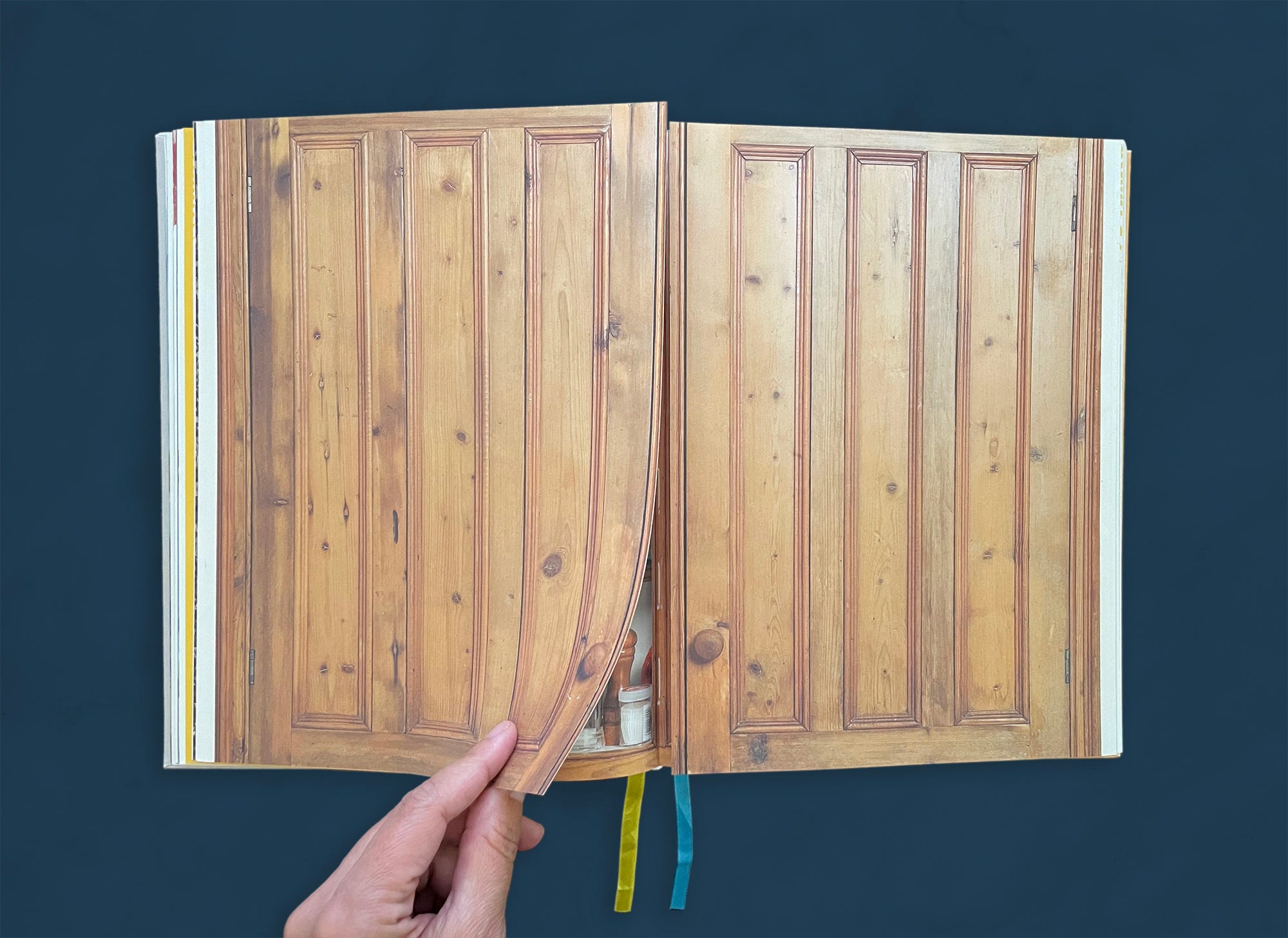
A cupboard in McEvedy’s kitchen provided the setting for the second gatefold, displaying a collection of ingredients and their profiles typeset on crumpled paper. The paper is photographed pinned to the inside of the cupboard doors. Again we see the icons, a fun and practical element that provides us another layer of quickly digestible information.
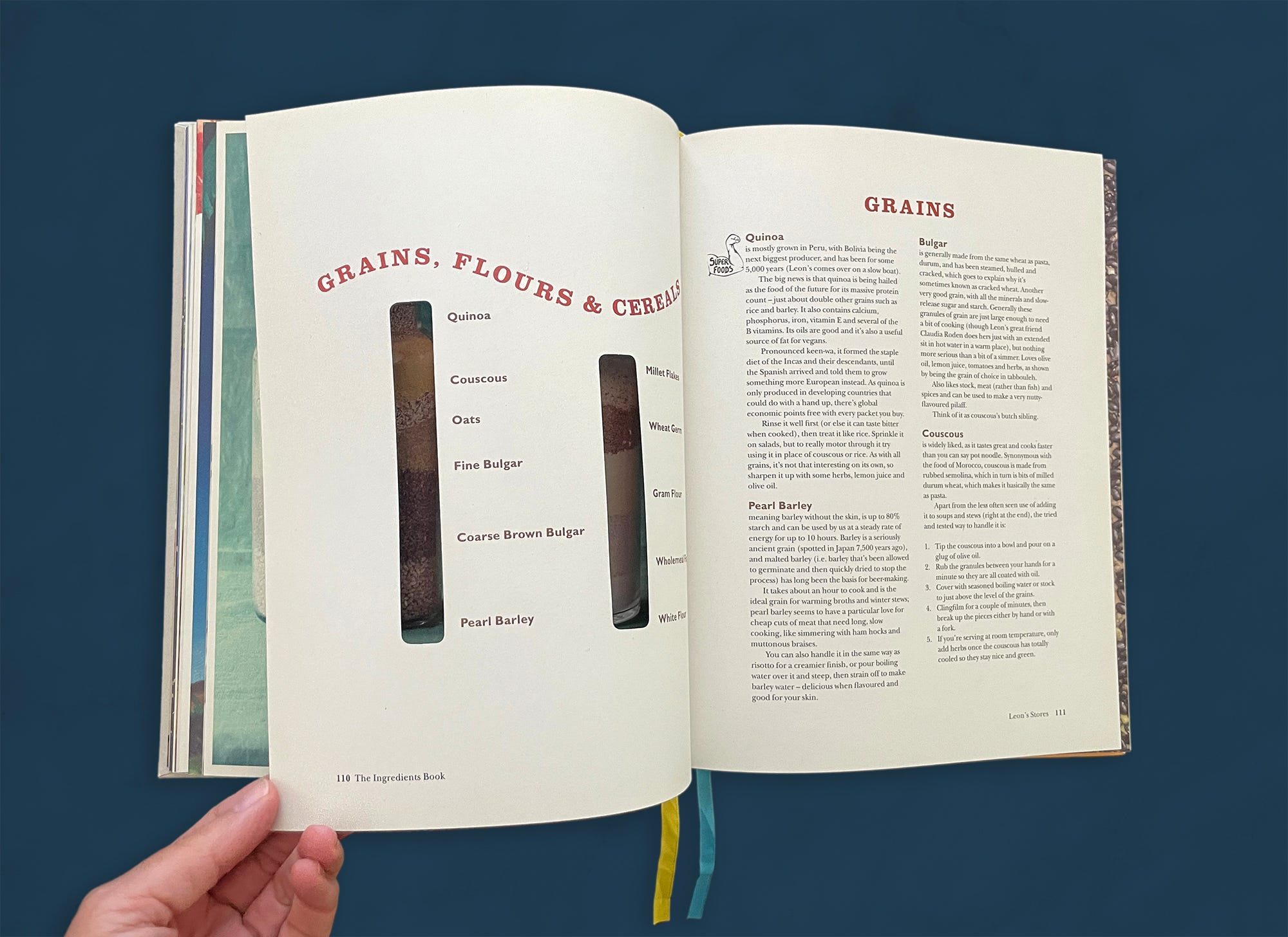
The “Grains, Flours & Cereals” section opens with a photo of artfully composed grains in jars. The right page has two die cuts that reveal text on the following spread. It’s only when we turn the page that we understand that the cuts reveal the two larger jars on the previous spread, cleverly indicating a key to their contents [final image above]. Dearden recalls that this was done so that they could be named “without ruining the picture.”
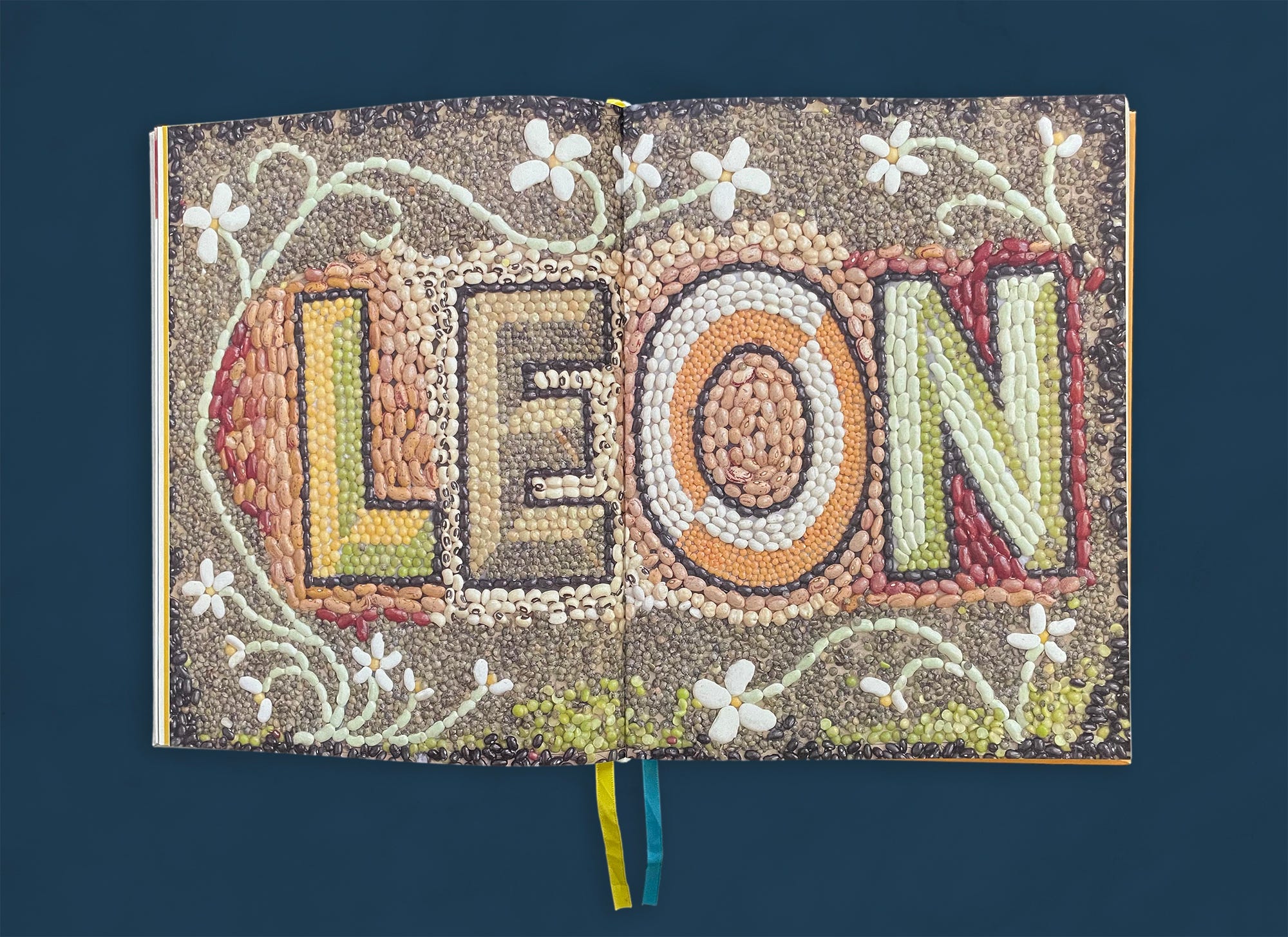
Flora McEvedy’s sister-in-law created the playful dried-bean mosaic that precedes the “Pulses” section. The mosaic recalls ancient Greco-Roman frescoes, a sly nod toward the Mediterranean influences in LEON’s food. Allegra McEvedy added that it resembles a welcome doormat, an appropriate reference in this convivial cookbook.
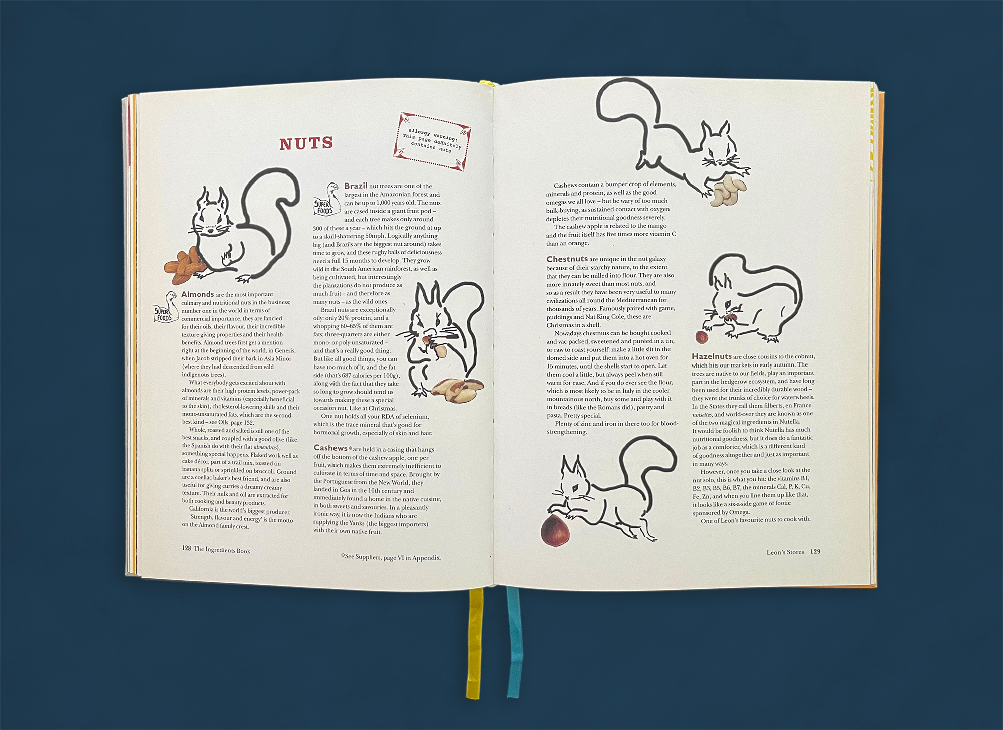
Spot illustrations (small drawings that often interact with text) can be found sprinkled throughout the book. The spot illustrations in the “Nuts” section are one of the most notable examples of how practical information is often infused with whimsy. Dearden explains that “I drew some crazy squirrels because what else goes with nuts.”
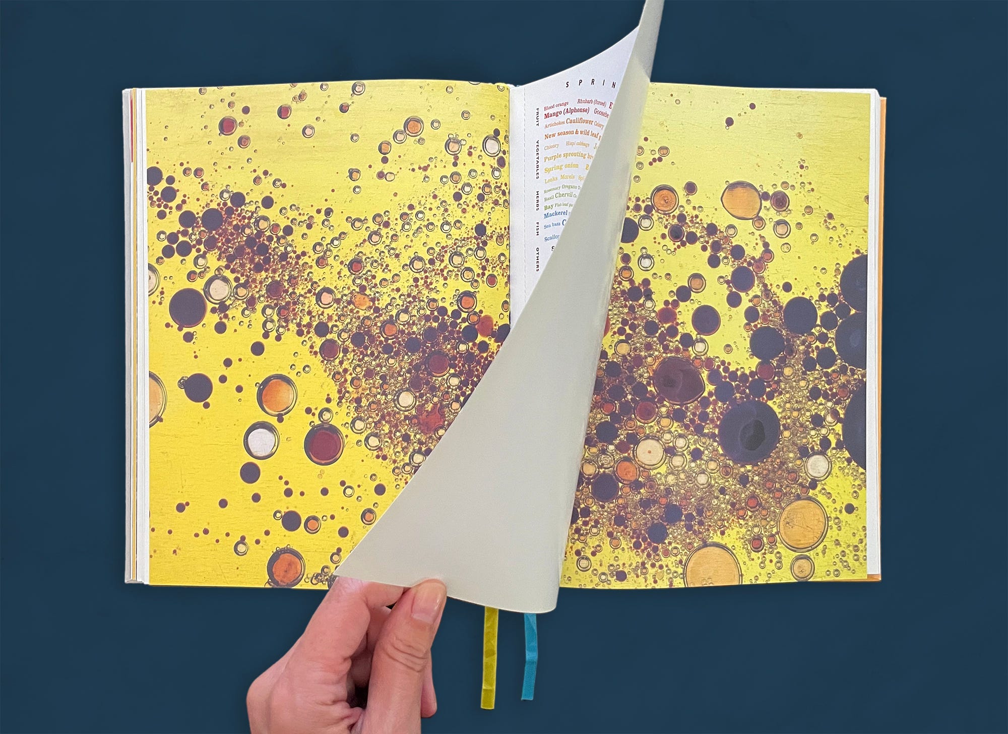
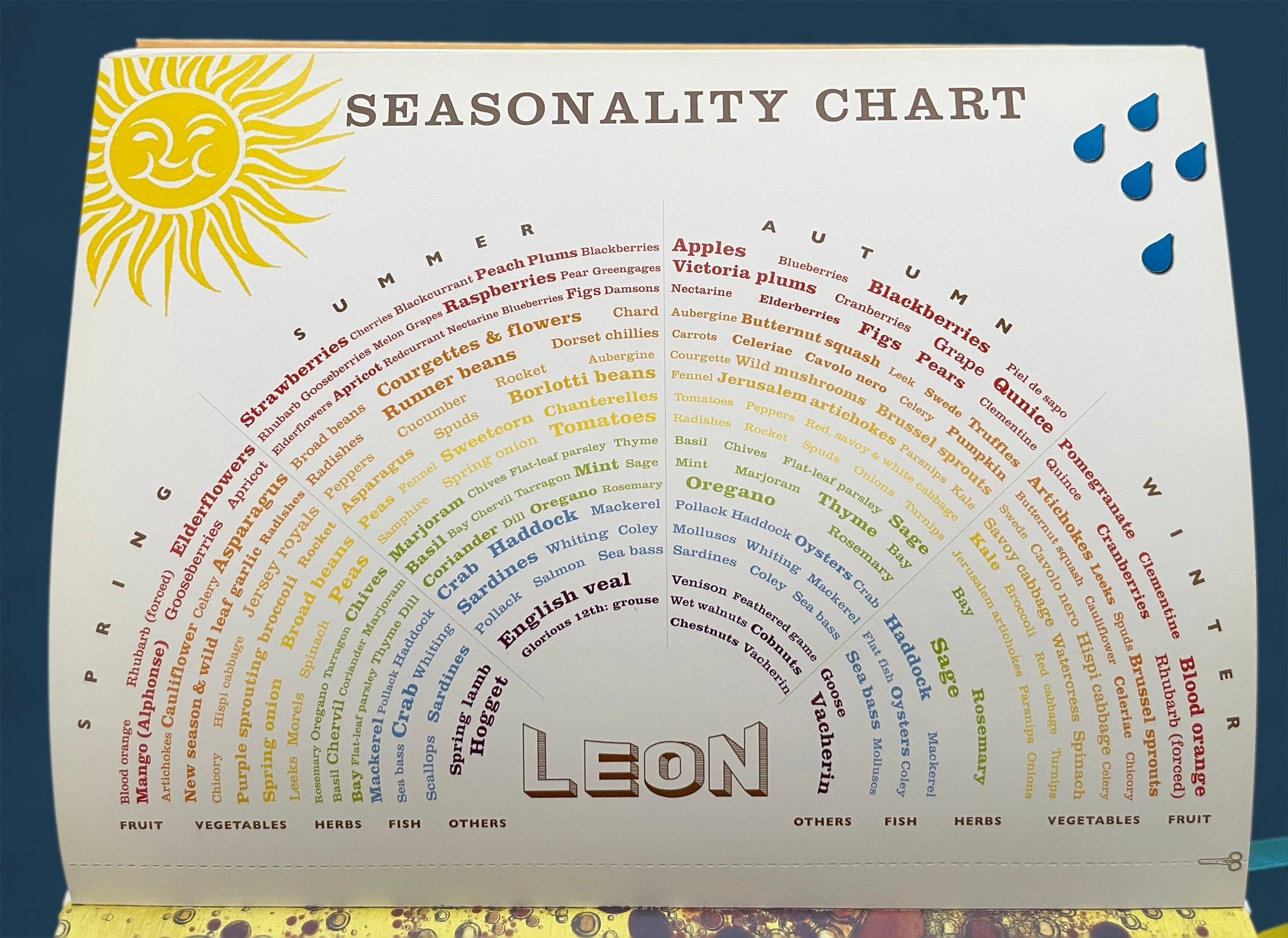
A perforated seasonality chart printed on heavy cardstock is inserted within a striking full-spread photo of oil and vinegar. Dearden designed the chart to be torn out and displayed on people’s refrigerators, a quick reference to which ingredients are in season and when. McEvedy calls the chart “genius,” commenting that you cannot help but be drawn into its clever design.
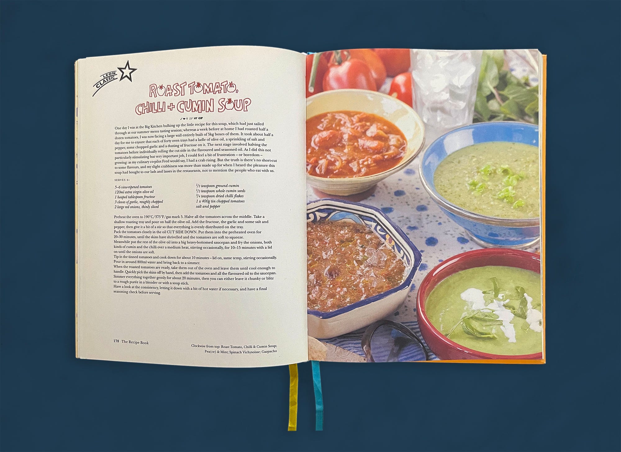
The “Soups” chapter occasionally departs from the typical typeset recipe head by featuring titles drawn to resemble items on the hand-lettered menu boards in the original LEON restaurants.
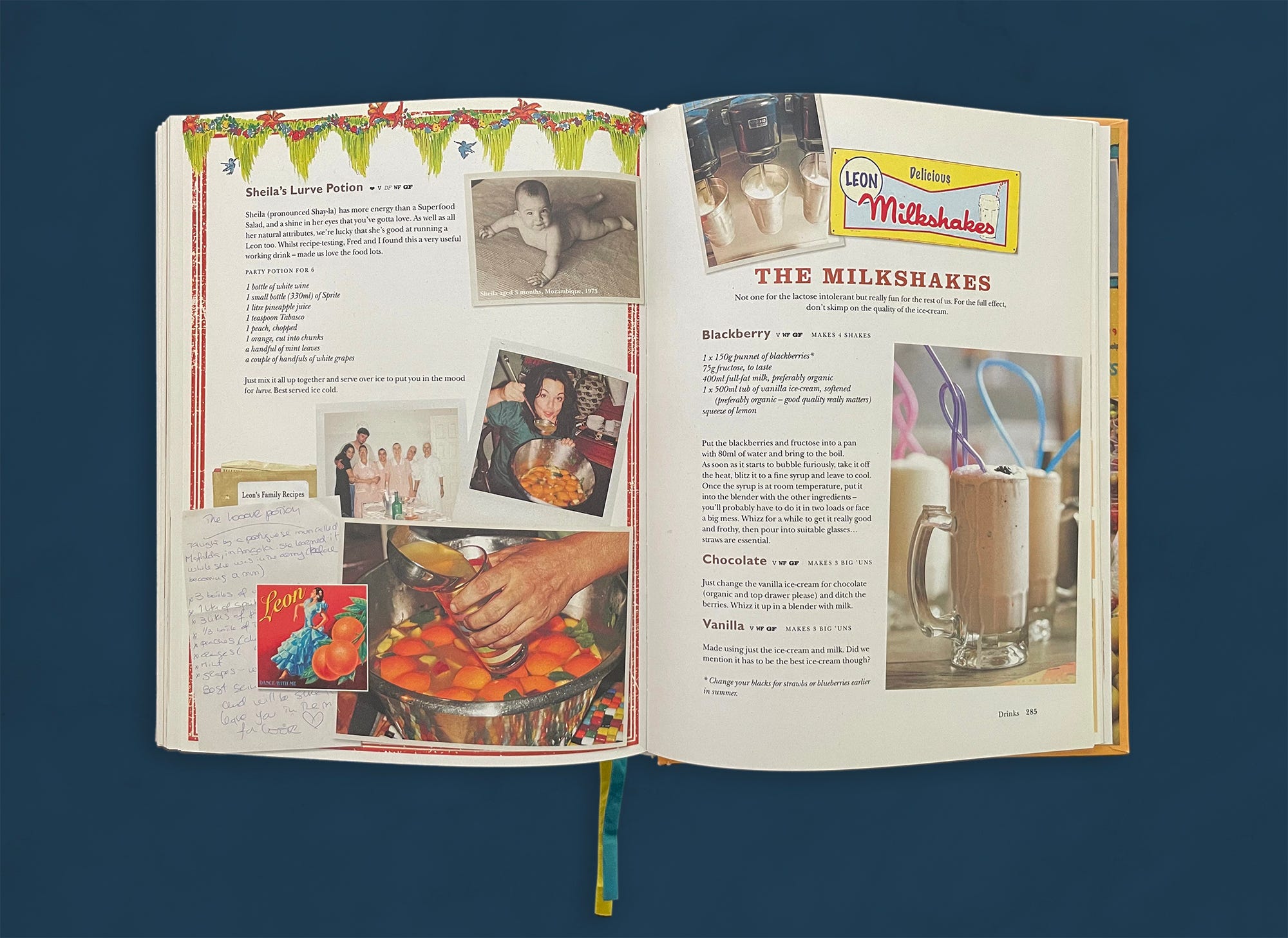
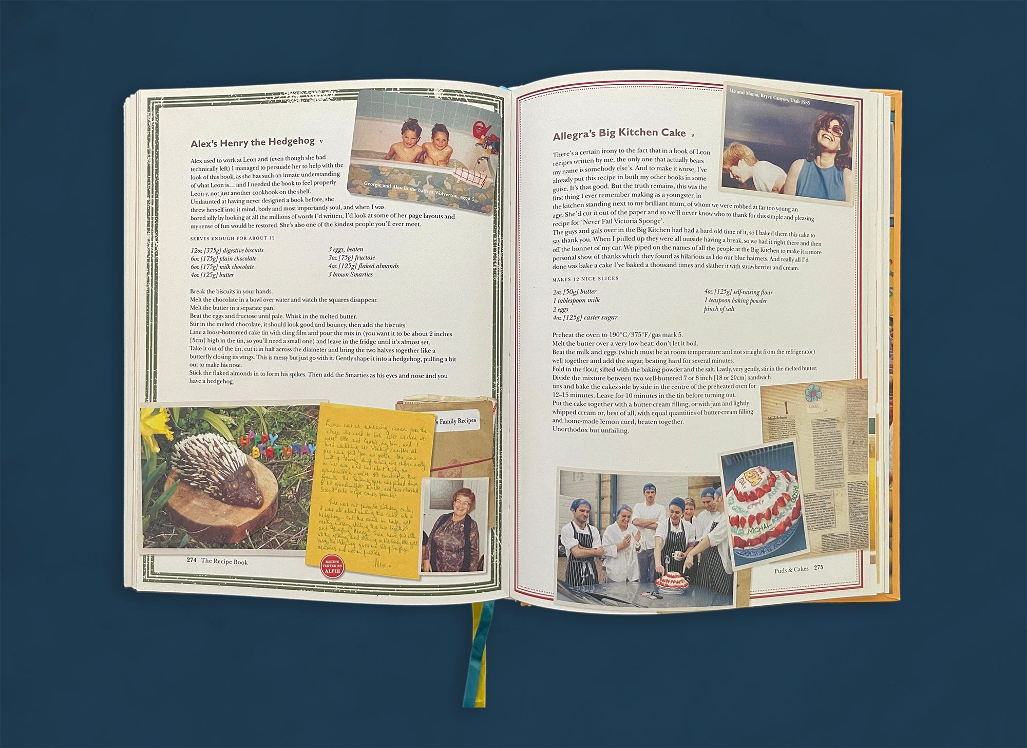
Though the friends and family recipes feel loose and spontaneous, they all follow a specific visual formula that helps ground them within the design. Each one is framed in color, with at least one snapshot and a handwritten or typed note, and a crumpled brown paper envelope labeled “Leon’s Family Recipes.” The handmade notes play an important part in the intimate feel of these pages. Christie remarks that he later learned to think twice about embedding text into a photograph, which makes translating the text in foreign language editions quite difficult.
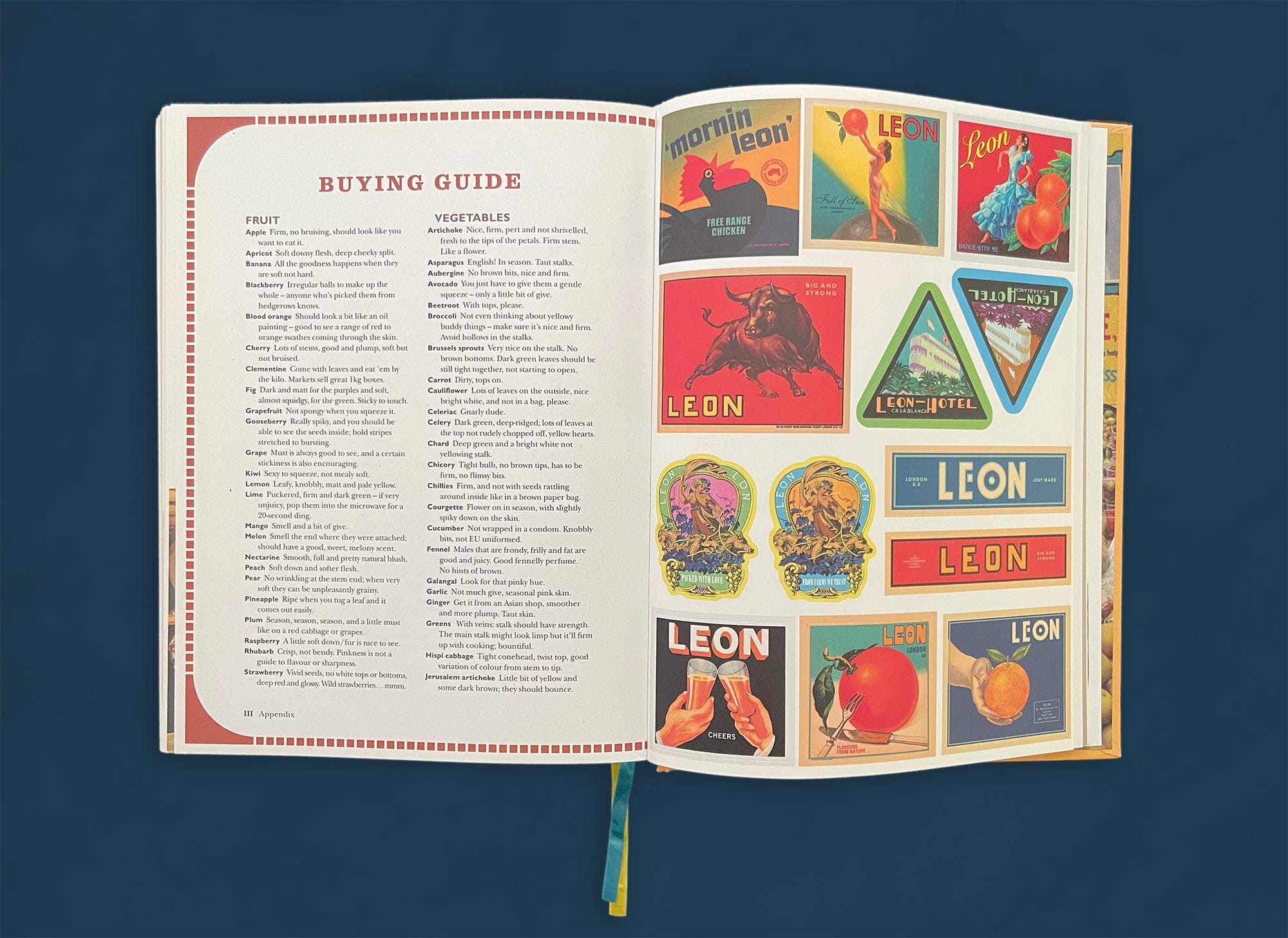
Vintage packaging art makes another appearance, this time as a sheet of colorful stickers in the back of the book. The stickers are the same ones that were used to close LEON’s take-out boxes.
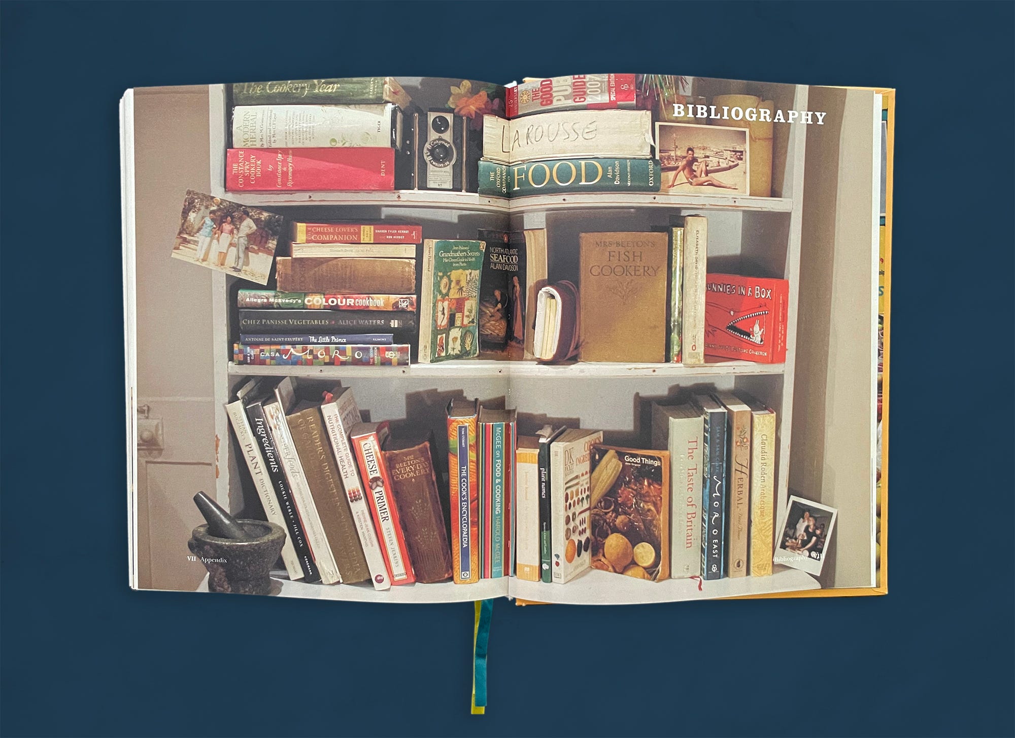
Nearing the end of our journey through the book, we find a purely visual bibliography—normally something that we would be surprised to see in a cookbook but at this point feels completely in line with LEON’s irreverent spirit. Dearden photographed the books in her bookcase at home, with a photo of LEON’s namesake, co-owner John Vincent’s father, tucked into the upper right-hand corner.
The acknowledgements are a spread with photos, short messages, and an exhaustive list of names embedded into a huge “THANK YOU,” the latter being a typesetting feat that would make any designer gasp. As the team continually recalled more names to add to the list, Christie remembers that “eventually we had to say stop, we need to print!”
Many thanks to Allegra McEvedy, Flora McEvedy, Alex Dearden, and Jonathan Christie for sharing with me their experiences in creating LEON: Ingredients & Recipes.
Frances Baca is principal of Frances Baca Design and Consulting in Berkeley, California. Her studio focuses on editorial design and creative direction and consulting. She has designed and art directed countless cookbooks, and she was the founding design director of the much-loved food and culture journal Gastronomica. Her work has been recognized by the James Beard Foundation, the Society of Publication Designers, the Association of American University Presses, Graphic Design USA, the New England Book Show, and Bookbuilders West. You can hear more about her thoughts on cookbook design in the Salt + Spine podcast.


